机器学习简单数据分析案例
·
分享一个用机器学习简单分析数据的案例,可以用于课设,数据集链接在此处。
首先导入依赖库
import pandas as pd
import lightgbm as lgb
from sklearn.model_selection import train_test_split
from sklearn.preprocessing import LabelEncoder
from sklearn.metrics import accuracy_score, classification_report, confusion_matrix
from sklearn.metrics import precision_score, recall_score, f1_score
import numpy as np
from sklearn.model_selection import GridSearchCV, StratifiedKFold
from sklearn.metrics import roc_curve, auc
import matplotlib.pyplot as plt
from lightgbm import LGBMClassifier
import seaborn as sns
import shap
加载数据集
df = pd.read_csv('/home/a329/分类机器学习画图/cardio_data_processed.csv')
预览数据
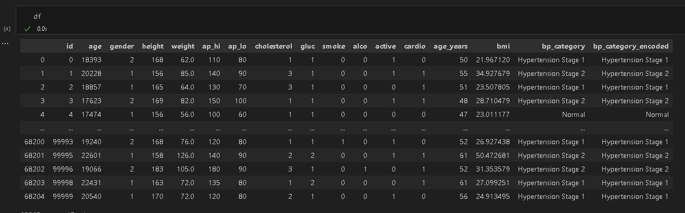
删除指定列列
columns_to_drop = ['id', 'cardio', 'bp_category']

# 删除指定列s
X = df.drop(columns=columns_to_drop)
将文本特征编码为数字特征
label_encoder = LabelEncoder()
for col in X.columns:
    if X[col].dtype == 'object':
        X[col] = label_encoder.fit_transform(df[col])
结果如下所示
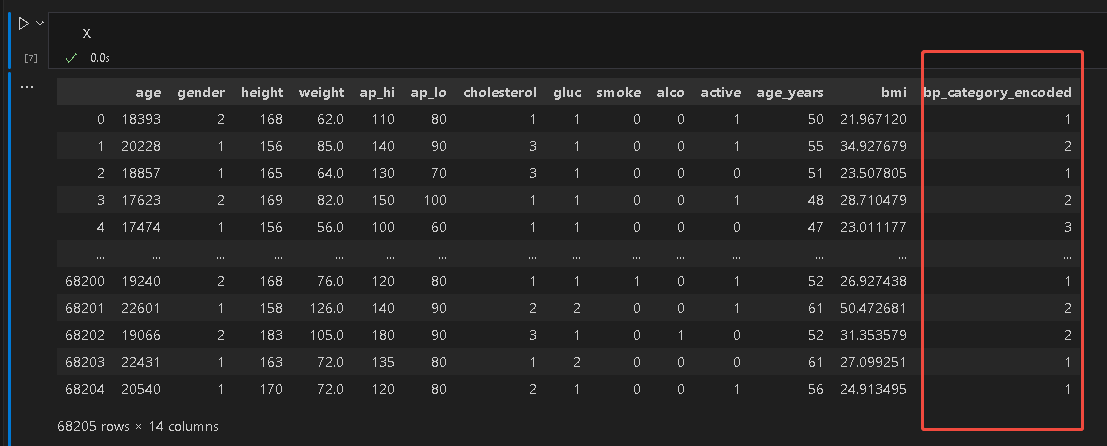
定义目标
y = df['cardio']
数据集划分
X_train, X_test, y_train, y_test = train_test_split(
    X, y, test_size=0.2, random_state=42, stratify=y
)
构建数据集
train_data = lgb.Dataset(X_train, label=y_train)
test_data = lgb.Dataset(X_test, label=y_test, reference=train_data)
定义超参数
params = {
    'boosting_type': 'gbdt',          # 提升类型(可选:gbdt, dart, goss)
    'objective': 'binary',        # 分类任务;如果是二分类则用 'binary'
    'metric': 'accuracy',             # 评估指标
    'num_leaves': 31,                 # 叶子节点数(控制模型复杂度)
    'learning_rate': 0.05,            # 学习率
    'feature_fraction': 0.9,          # 随机选择特征的比例
    'bagging_fraction': 0.8,          # 随机选择样本的比例
    'bagging_freq': 5,                # 每 5 次迭代进行一次 bagging
    'verbose': 0                      # 不输出训练信息
}
定义五折交叉验证
# 定义五折交叉验证
skf = StratifiedKFold(n_splits=5, shuffle=True, random_state=42)
定义曲线颜色
# 自定义颜色(5种颜色,对应5个折叠)
custom_colors = ['#C61586', '#D33594', '#E164A7', '#F090BA', '#FFBFCD']
定义模型
model = LGBMClassifier(
    boosting_type='gbdt',
    objective='binary',
    metric='binary_logloss',
    learning_rate=0.05,
    num_leaves=31,
    verbose=-1
)
模型交叉验证可视化
# 存储结果
all_fpr = []
all_tpr = []
aucs = []
mean_fpr = np.linspace(0, 1, 100)  # 用于绘制平均 ROC 曲线

plt.figure(figsize=(8, 6))

for i, (train_index, test_index) in enumerate(skf.split(X, y)):
    X_train, X_test = X.iloc[train_index], X.iloc[test_index]
    y_train, y_test = y.iloc[train_index], y.iloc[test_index]

    # 训练模型
    model.fit(X_train, y_train)

    # 预测概率
    y_score = model.predict_proba(X_test)[:, 1]

    # 计算 ROC 曲线和 AUC
    fpr, tpr, _ = roc_curve(y_test, y_score)
    roc_auc = auc(fpr, tpr)

    # 存储结果
    all_fpr.append(fpr)
    all_tpr.append(tpr)
    aucs.append(roc_auc)

    # 绘制单个折叠的 ROC 曲线
    plt.plot(fpr, tpr,
             color=custom_colors[i],
             lw=2,
             label=f'Fold {i+1} (AUC = {roc_auc:.2f})')

# 计算平均 ROC 曲线
mean_tpr = np.zeros_like(mean_fpr)
for i in range(len(all_tpr)):
    mean_tpr += np.interp(mean_fpr, all_fpr[i], all_tpr[i])
mean_tpr /= len(all_tpr)


# 绘制平均 ROC 曲线和置信区间
plt.plot(mean_fpr, mean_tpr,
         color='black', lw=2,
         label=f'Mean ROC (AUC = {auc(mean_fpr, mean_tpr):.2f})')

# 完善图形
plt.plot([0, 1], [0, 1], color='navy', lw=1, linestyle='--', label='Random Guess')
plt.xlim([0.0, 1.0])
plt.ylim([0.0, 1.05])
plt.xlabel('False Positive Rate (FPR)')
plt.ylabel('True Positive Rate (TPR)')
plt.title('ROC Curves for 5-Fold Cross Validation')
plt.legend(loc="lower right")
plt.grid(True)
plt.tight_layout()
plt.show()
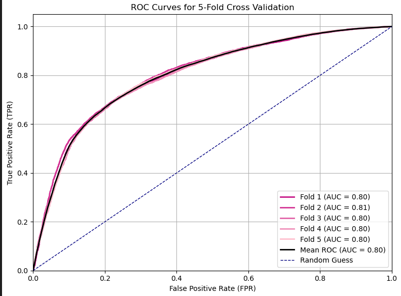
模型训练
model = lgb.train(
    params=params,
    train_set=train_data,
    num_boost_round=1000,            # 最大迭代次数
    valid_sets=[test_data],          # 验证集
)
预测和评估
# 预测和评估
y_pred = model.predict(X_test, num_iteration=model.best_iteration)
y_pred = y_pred.argmax(axis=1) if len(np.unique(y)) > 2 else (y_pred > 0.5).astype(int)
print("准确率:", accuracy_score(y_test, y_pred))
打印模型的相关指标
print(classification_report(y_test, y_pred))
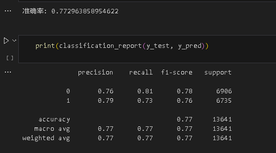
单独计算各个指标
# 单独计算指标
precision = precision_score(y_test, y_pred, average='macro')
recall = recall_score(y_test, y_pred, average='macro')
f1 = f1_score(y_test, y_pred, average='macro')

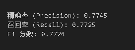
print(f"\n精确率 (Precision): {precision:.4f}")
print(f"召回率 (Recall): {recall:.4f}")
print(f"F1 分数: {f1:.4f}")
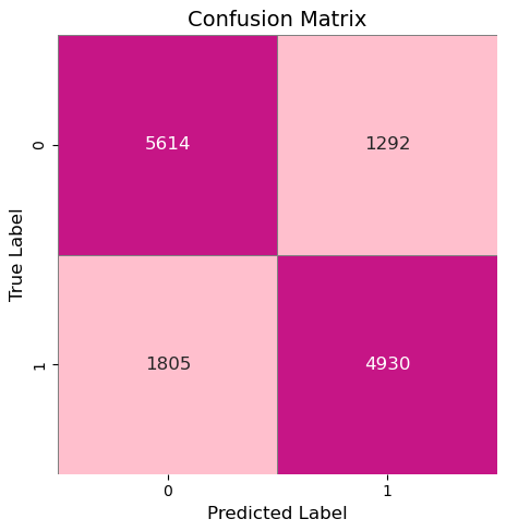
绘制混淆矩阵
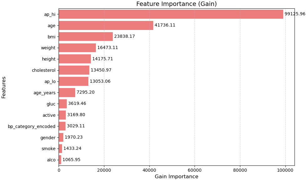
提取特征重要性
# 提取特征重要性(可选类型:'split' 或 'gain')
feature_importance = model.feature_importance(importance_type='gain')  # 推荐使用 'gain'

# 获取特征名称(假设 X_train 是训练数据)
feature_names = X_train.columns.tolist()

# 创建特征重要性字典
importance_dict = dict(zip(feature_names, feature_importance))

# 按重要性降序排序
sorted_importance = sorted(importance_dict.items(), key=lambda x: x[1], reverse=True)

# 限制显示特征数量(例如前 20 个)
top_features = sorted_importance
top_names = [x[0] for x in top_features]
top_values = [x[1] for x in top_features]

# 使用与之前 ROC 曲线相同的自定义颜色(5 种颜色)
custom_colors = ['#FF6B6B']

# 如果特征数量超过颜色数量,可循环使用颜色
colors = [custom_colors[i % len(custom_colors)] for i in range(len(top_names))]

plt.figure(figsize=(10, 6))

# 绘制条形图
sns.barplot(x=top_values, y=top_names, palette=colors)

# 添加数值标签
for i, (value, name) in enumerate(zip(top_values, top_names)):
    plt.text(value, i, f' {value:.2f}', va='center', ha='left')

# 设置标题和坐标轴标签
plt.title('Feature Importance (Gain)', fontsize=14)
plt.xlabel('Gain Importance', fontsize=12)
plt.ylabel('Features', fontsize=12)

# 调整字体大小和样式
plt.tick_params(axis='both', labelsize=10)
plt.grid(True, axis='x', linestyle='--', alpha=0.6)

# 显示图形
plt.tight_layout()
plt.show()
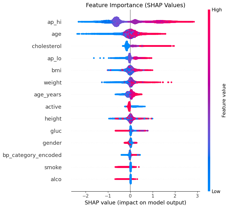
初始化shap解释器
# 初始化 SHAP 解释器(推荐使用 TreeExplainer)
explainer = shap.TreeExplainer(model)
shap_values = explainer.shap_values(X_train)  # 二分类返回两个数组,多分类返回多个数组

# 如果是二分类任务,取正类的 SHAP 值
if isinstance(shap_values, list):
    shap_values = shap_values[1]  # 二分类时取正类(索引为1)
绘制蜂巢图,蜂巢图特征重要性与之前用的api所得结果基本吻合
plt.figure(figsize=(10, 6))

# 蜂巢图:展示特征重要性和 SHAP 值分布
shap.summary_plot(
    shap_values,
    X_train,
    feature_names=X_train.columns,  # 如果 X_train 是 DataFrame
    show=False                        # 不自动显示
)

plt.title("Feature Importance (SHAP Values)", fontsize=14)
plt.tight_layout()
plt.show()
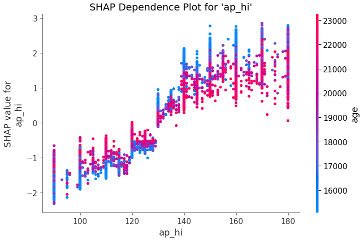
绘制依赖图
# 选择要分析的特征(例如 'feature_name')
feature_name = 'ap_hi'

plt.figure(figsize=(8, 6))

# 依赖图:展示特征与 SHAP 值的关系
shap.dependence_plot(
    feature_name,
    shap_values,
    X_train,
    feature_names=X_train.columns,
    show=False
)

plt.title(f"SHAP Dependence Plot for '{feature_name}'", fontsize=14)
plt.tight_layout()
plt.show()
前两个特征ap_hi和age相互影响较大,从图中可以看出,ap_hi越大,分类结果越容易是正向,并且能看到一种趋势——当ap_hi高于130时,似乎age越小分类结果越容易是正向,而ap_hi小于130则结果反之。这也说明越小的年龄表现出高的ap_hi越反常。
挑选一个样本绘制力图
# 选择一个样本进行解释(例如第 0 个样本)
sample_index = 0
x = X_train.iloc[sample_index]  # 如果 X_train 是 DataFrame

# 力图:解释单个预测的 SHAP 贡献
shap.force_plot(
    explainer.expected_value,     # 基线值(二分类时为正类基线)
    shap_values[sample_index],    # 当前样本的 SHAP 值
    x,                            # 特征值
    feature_names=X_train.columns,
    matplotlib=True,              # 使用 matplotlib 绘制
    show=False                    # 不自动显示
)

plt.title(f"SHAP Force Plot for Sample {sample_index}", fontsize=14)
plt.tight_layout()
plt.show()

初始化超参数
# 初始参数(固定部分)
base_params = {
    'boosting_type': 'gbdt',
    'objective': 'binary',
    'metric': 'binary_logloss',  # 二分类常用损失函数
    'learning_rate': 0.05,
    'feature_fraction': 0.9,
    'bagging_fraction': 0.8,
    'bagging_freq': 5,
    'verbose': -1
}


# 超参数搜索空间
param_grid = {
    'num_leaves': [15, 31, 63],          # 叶子节点数
    'max_depth': [3, 5, 7],              # 树的最大深度
    'learning_rate': [0.01, 0.05, 0.1],  # 学习率
    'n_estimators': [50, 100, 200],      # 树的数量
    'min_child_samples': [20, 50, 100]   # 叶子节点最小样本数
}
创建另一个分类器
# 创建 LightGBM 分类器
lgbm = lgb.LGBMClassifier(**base_params)

# 五折交叉验证(分层抽样,适合不平衡数据)
cv = StratifiedKFold(n_splits=5, shuffle=True, random_state=42)

# 初始化 GridSearchCV
grid_search = GridSearchCV(
    estimator=lgbm,
    param_grid=param_grid,
    cv=cv,
    scoring='accuracy',
    n_jobs=-1,  # 并行计算
    verbose=1
)
进行超参数搜索(demo,效果没有不调参的好,需要进一步调参)
# 启动搜索
grid_search.fit(X, y)

# 输出最佳参数和交叉验证结果
print("最佳参数:", grid_search.best_params_)
print("最佳交叉验证准确率:", grid_search.best_score_)
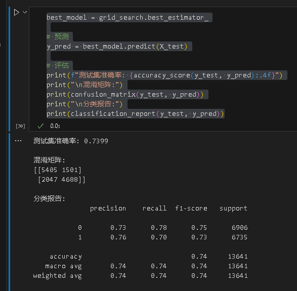
得到优化后的结果
best_model = grid_search.best_estimator_

# 预测
y_pred = best_model.predict(X_test)

# 评估
print(f"测试集准确率: {accuracy_score(y_test, y_pred):.4f}")
print("\n混淆矩阵:")
print(confusion_matrix(y_test, y_pred))
print("\n分类报告:")
print(classification_report(y_test, y_pred))

码道开发者社区,聚焦华为云码道 CodeArts 代码智能体,沉淀 Agent、Skill、鸿蒙开发实战内容,供开发者查阅资料、交流技术、分享工程实践
更多推荐



 3
3 0
0- 0


 已为社区贡献4条内容

所有评论(0)