中级前端进阶 第十二步) 深入CSS3 Flex布局,附源码,可视化演示等
《中级前端进阶方向 第一步)JavaScript 微任务 / 宏任务机制》
《中级前端进阶方向 第二步)深入事件循环(Event Loop)》
《中级前端进阶方向 第三步)深入javascript原型链,附学习代码》
《中级前端进阶方向 第四步)深入javascript 闭包、this 、作用域提升,附学习案例源码》
《中级前端进阶方向 第五步)深入 javascript高级特性Proxy,附学习案例源码》
《中级前端进阶方向 第六步)深入 javascript 高级特性Generator生成器,附案例源码》
《中级前端进阶方向 第七步)深入 javascript 高级特性Async/Await,附源码》《中级前端进阶方向 第八步)深入 javascript 高级特性 Promise,附案例源码》
《中级前端进阶方向 第九步)深入 javascript 高级特性 模块化 与 装饰器,附案例源码》
《中级前端进阶方向 第十步)深入 浏览器性能优化(渲染机制、内存泄漏..),附案例源码》
--🖍《CSS》-----------------------------------------------------------------------------------------《中级前端进阶 第十一步) 深入CSS3 新特性,附源码,可视化演示等》
--🖍《延伸扩展》-----------------------------------------------------------------------------------------
《中级前端进阶方向 延伸扩展一)javascript 私有状态/工厂函数/回调中保持局部状态/防抖与节流/IIFE 捕获》
一、Flex 的基本概念(主轴 / 交叉轴)
-
Flex 是一维布局模型:按主轴(main axis)排列(可横向或纵向),在另一方向为交叉轴(cross axis)。
-
容器成为 flex 后,其直接子元素称为 flex items(只影响直接子元素)。
-
display: flex(块级 flex container)或display: inline-flex(行内 flex container)。
二、容器(flex container)常用属性
.container {
  display: flex;                /* 或 inline-flex */
  flex-direction: row;          /* row | row-reverse | column | column-reverse */
  flex-wrap: nowrap;            /* nowrap | wrap | wrap-reverse */
  justify-content: flex-start;  /* 主轴对齐:flex-start | flex-end | center | space-between | space-around | space-evenly */
  align-items: stretch;         /* 交叉轴对齐:stretch | flex-start | flex-end | center | baseline */
  align-content: stretch;       /* 多行时的行与行之间分配:stretch | flex-start ... (仅在多行时生效) */
  gap: 12px 20px;               /* 行间距/列间距:gap | row-gap | column-gap(现代写法) */
}
要点:
-
flex-direction决定主轴(row水平从左到右,column则竖直从上到下)。 -
flex-wrap决定超出主轴空间时子项是否换行(否则会压缩)。 -
justify-content控制主轴上的分布(左右/上下)。 -
align-items控制单行交叉轴对齐(默认stretch,会拉伸高度/宽度以填满交叉轴)。 -
align-content仅对多行(wrap)有效,用来控制行与行之间的分布(类似于justify-content在交叉轴上)。
三、项目(flex item)常用属性
.item {
  order: 0;              /* 控制视觉顺序(整数),默认 0;注意:不会改变 DOM 实际顺序(无障碍/键盘导航仍按 DOM)*/
  flex-grow: 0;          /* 增长因子,默认 0 */
  flex-shrink: 1;        /* 收缩因子,默认 1 */
  flex-basis: auto;      /* 初始基准尺寸(可为 px/%/auto) */
  /* 简写 */
  flex: 0 1 auto;        /* 常见值:flex: initial | auto | none | 1 | 1 1 0% ... */
  align-self: auto;      /* 覆盖容器的 align-items(auto | flex-start | center | stretch | ...) */
  min-width, min-height, max-width, max-height /* 限制尺寸 */
  margin: 0;             /* auto margin 在 flex 中非常有用(可用于推开/居中)*/
}
重要 shorthand 说明(常被误解):
-
flex: 1等同于flex: 1 1 0%—— 表示可增长、可收缩、基准为0%(常用于“等分”布局)。 -
flex: auto=1 1 auto,基于内容的基础尺寸,可增长与收缩。 -
flex: initial=0 1 auto(默认值)。 -
flex: none=0 0 auto(不增长不收缩)。
四、常见布局场景与示例
1. 水平居中 + 垂直居中(最常见)
<div class="center">
  <div class="box">居中内容</div>
</div>
.center {
  display: flex;
  justify-content: center; /* 主轴居中 */
  align-items: center;     /* 交叉轴居中 */
  height: 300px;
}
2. 导航栏两端分布(Logo 左,链接右)
.nav {
  display: flex;
  align-items: center;
  justify-content: space-between;
}
3. 等宽列(忽略内容差异)
.row { display: flex; gap: 16px; }
.col { flex: 1; } /* 每列同等分配宽度 */
4. 等高卡片(垂直伸展)
父容器:
.card-list { display:flex; gap:16px; align-items: stretch; }
.card { flex:1; display:flex; flex-direction:column; }
.card .body { flex:1; } /* body 拉伸,footer 固定 */
5. 响应式:大屏水平,小屏垂直(常见)
.container { display:flex; gap:12px; flex-wrap:wrap; }
@media (max-width:600px) {
  .container { flex-direction: column; }
}
6. 粘性页脚(sticky footer)
html,body { height:100%; }
.page { min-height:100vh; display:flex; flex-direction:column; }
.main { flex:1; } /* 主体占满剩余高度,footer 在底部 */
五、更细致的行为与常见坑
1. flex-basis: auto 与 flex-basis: 0
-
auto:基于内容的尺寸(再做分配)。如果你想忽视内容宽度并均分空间,用flex: 1 1 0%(即基准 0)。 -
场景:列内文本很长时,
flex-basis: auto会使某列较宽,导致其他列变窄;设置flex-basis: 0则会平均分配。
2. min-width: auto 导致内容不被压缩
-
默认情况下,flex items 的
min-width/min-height是auto,这会阻止它们小于内容最小尺寸(可能使容器溢出)。如果希望允许更强的压缩,设置min-width: 0;或min-height: 0;(很常见于含有滚动子元素的布局)。 -
常见场景:水平 flex 中子项包含文本或溢出元素,设置
min-width: 0可以让其正确换行或显示滚动。
3. align-items: stretch 与高度控制
-
默认
stretch会使单行项在交叉轴上拉伸以填满容器。如果不想拉伸,改为align-items: flex-start或给每个 item 明确高度。
4. order 不改变 DOM 顺序
-
虽然
order改变视觉顺序,但键盘 tab 顺序、源代码语义和语义化阅读器仍按 DOM,滥用可能影响可访问性。优先通过合理 DOM 顺序 + CSS 来调整外观。
5. align-content 与单行/多行的误区
-
align-content只在有多行(flex-wrap: wrap)时才有意义。单行场景下使用align-items。
6. gap vs margin hack
-
现代浏览器支持
gap(行/列间距),比对每个子元素加 margin 更简洁且不需关注首尾消除。 -
兼容性:IE 不支持
gap,在需要兼容 IE11 时仍需使用 margin 方案或后备。
六、Flex 布局的计算(简要算法理解)
大致步骤(简化):
-
确定主轴方向,计算每个 item 的 flex base size(基尺)——由
flex-basis或内容决定。 -
计算容器剩余空间(总主轴可用空间减去基尺之和)。
-
分配正空间(grow)或负空间(shrink):按
flex-grow或flex-shrink * base-size的权重分配。 -
应用
min/max约束,再次调整(可能需要迭代)。 -
交叉轴上根据
align-items/align-self/align-content进行定位与尺寸调整。
理解这些可以帮助你调优 flex-basis 与 flex-shrink 组合。
七、调试技巧与浏览器工具
-
Chrome DevTools Elements 面板:选中 flex container,会出现 Flex 覆盖工具(显示主轴/交叉轴、gap、align、justify 等),可以实时切换属性。
-
使用
outline或background快速观察元素边界与伸缩。 -
如果布局不按预期,检查
min-width: 0、flex-basis、以及父容器是否是display:flex或display:block(有时嵌套关系导致误解)。 -
用
gap替代 margin 时检查旧浏览器兼容性。
八、性能与可访问性建议
-
Flexbox 布局本身性能良好,但深度嵌套或频繁 DOM 修改会触发重排(reflow)。避免在动画中频繁修改会触发行/绘制的属性(比如 width/left),优先使用
transform。 -
可访问性:不要用
order改变视觉顺序来弥补语义;保证 DOM 顺序与逻辑顺序一致以便键盘用户与屏幕阅读器友好。
九、常见实战小贴士(速查)
-
居中单元素:
display:flex; justify-content:center; align-items:center; -
等分列:
.item { flex: 1; } -
内容自适应列:
.item { flex: 0 1 auto; } -
忽略内容宽度均分:
.item { flex: 1 1 0%; }或flex:1 -
水平排布并换行:
display:flex; flex-wrap:wrap; gap:12px; -
sticky footer:
display:flex; flex-direction:column; min-height:100vh; main{flex:1}
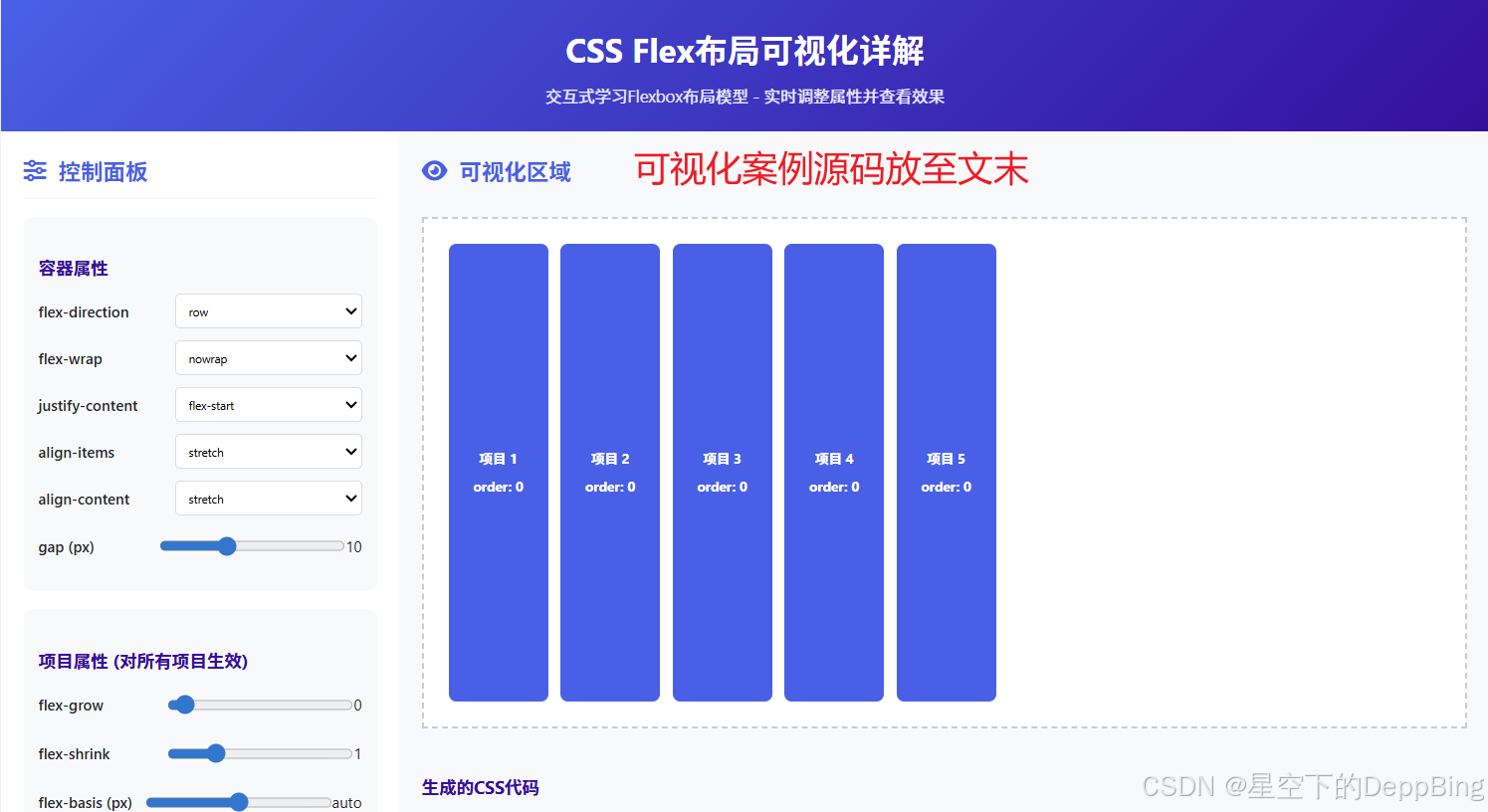
十、可视化案例演示
提供以下功能:
-
完整的Flexbox控制:
-
容器属性:flex-direction, flex-wrap, justify-content, align-items, align-content, gap
-
项目属性:flex-grow, flex-shrink, flex-basis
-
-
实时可视化:
-
所有属性调整都会立即反映在可视化区域
-
生成的CSS代码实时更新
-
-
预设布局示例:
-
居中布局
-
导航栏布局
-
卡片布局
-
侧边栏布局
-
网格布局
-
-
视觉效果控制:
-
可以调整容器和项目的背景颜色
-
可以调整文字颜色
-
-
响应式设计:
-
在移动设备上自动调整布局
-
所有控件都易于触摸操作
-
<!DOCTYPE html>
<html lang="zh-CN">
<head>
<meta charset="UTF-8">
<meta name="viewport" content="width=device-width, initial-scale=1.0">
<title>CSS Flex布局可视化详解</title>
<link rel="stylesheet" href="https://cdnjs.cloudflare.com/ajax/libs/font-awesome/6.4.0/css/all.min.css">
<style>
:root {
--primary: #4361ee;
--secondary: #3a0ca3;
--accent: #7209b7;
--light: #f8f9fa;
--dark: #212529;
--success: #4cc9f0;
--warning: #f72585;
--info: #4895ef;
--container-bg: #f8f9fa;
--item-bg: #4361ee;
--item-color: white;
}
* {
margin: 0;
padding: 0;
box-sizing: border-box;
font-family: 'Segoe UI', Tahoma, Geneva, Verdana, sans-serif;
}
body {
background-color: #f5f7ff;
color: var(--dark);
line-height: 1.6;
display: flex;
flex-direction: column;
min-height: 100vh;
}
header {
background: linear-gradient(135deg, var(--primary), var(--secondary));
color: white;
text-align: center;
padding: 1.5rem 1rem;
box-shadow: 0 4px 12px rgba(0, 0, 0, 0.1);
}
h1 {
font-size: 2.2rem;
margin-bottom: 0.5rem;
}
.subtitle {
font-size: 1.1rem;
opacity: 0.9;
max-width: 800px;
margin: 0 auto;
}
.main-container {
display: flex;
flex: 1;
overflow: hidden;
}
@media (max-width: 900px) {
.main-container {
flex-direction: column;
}
}
.controls-panel {
width: 320px;
background: white;
padding: 1.5rem;
overflow-y: auto;
box-shadow: 4px 0 10px rgba(0, 0, 0, 0.05);
}
.visualization-area {
flex: 1;
padding: 1.5rem;
background: var(--container-bg);
display: flex;
flex-direction: column;
}
h2 {
color: var(--primary);
margin-bottom: 1.2rem;
padding-bottom: 0.5rem;
border-bottom: 2px solid var(--light);
display: flex;
align-items: center;
}
h2 i {
margin-right: 10px;
}
h3 {
color: var(--secondary);
margin: 1.5rem 0 0.8rem;
}
p {
margin-bottom: 1rem;
}
.control-group {
background: #f8f9fa;
padding: 1rem;
border-radius: 8px;
margin-bottom: 1.2rem;
}
.control-row {
display: flex;
justify-content: space-between;
align-items: center;
margin-bottom: 0.8rem;
}
label {
font-weight: 500;
flex: 1;
}
select, input[type="range"], input[type="number"] {
padding: 0.5rem;
border: 1px solid #ddd;
border-radius: 4px;
width: 150px;
}
input[type="color"] {
width: 60px;
height: 35px;
padding: 2px;
}
.flex-container {
flex: 1;
background: white;
border: 2px dashed #ccc;
padding: 20px;
margin-bottom: 1.5rem;
min-height: 400px;
display: flex;
/* 这些属性将通过JS控制 */
flex-direction: row;
flex-wrap: nowrap;
justify-content: flex-start;
align-items: stretch;
align-content: stretch;
gap: 10px;
}
.flex-item {
background: var(--item-bg);
color: var(--item-color);
padding: 15px;
border-radius: 6px;
min-width: 80px;
display: flex;
align-items: center;
justify-content: center;
font-weight: bold;
/* 这些属性将通过JS控制 */
order: 0;
flex-grow: 0;
flex-shrink: 1;
flex-basis: auto;
align-self: auto;
}
.item-controls {
display: grid;
grid-template-columns: 1fr 1fr;
gap: 1rem;
}
.code-container {
background: #2d2d2d;
color: #f8f8f2;
border-radius: 6px;
padding: 1rem;
overflow-x: auto;
font-family: 'Fira Code', monospace;
margin-top: 1.5rem;
}
.code-comment {
color: #8292a2;
}
.code-keyword {
color: #f92672;
}
.code-function {
color: #e6db74;
}
.code-parameter {
color: #fd971f;
}
.code-string {
color: #a6e22e;
}
.code-number {
color: #ae81ff;
}
.btn {
display: inline-block;
background: var(--primary);
color: white;
padding: 0.6rem 1.2rem;
border: none;
border-radius: 4px;
cursor: pointer;
font-weight: bold;
transition: background 0.3s;
margin-right: 0.5rem;
margin-bottom: 0.5rem;
}
.btn:hover {
background: var(--secondary);
}
.btn-warning {
background: var(--warning);
}
.btn-warning:hover {
background: #d11a66;
}
.btn-success {
background: var(--success);
}
.btn-success:hover {
background: #3bb0d0;
}
.preset-buttons {
display: flex;
flex-wrap: wrap;
gap: 0.5rem;
margin: 1rem 0;
}
.preset-btn {
background: #e9ecef;
border: none;
padding: 0.5rem 1rem;
border-radius: 4px;
cursor: pointer;
transition: all 0.3s;
}
.preset-btn:hover {
background: #dee2e6;
}
.item-info {
display: flex;
align-items: center;
justify-content: center;
flex-direction: column;
text-align: center;
font-size: 0.9rem;
}
.item-info span {
display: block;
margin-top: 5px;
}
footer {
text-align: center;
padding: 1.5rem;
color: #6c757d;
background: white;
border-top: 1px solid #dee2e6;
}
.tip {
background: #e9f7fe;
border-left: 4px solid var(--info);
padding: 1rem;
margin: 1rem 0;
border-radius: 0 4px 4px 0;
}
.highlight {
background: #fff3cd;
border-left: 4px solid #ffc107;
padding: 1rem;
margin: 1rem 0;
border-radius: 0 4px 4px 0;
}
</style>
</head>
<body>
<header>
<h1>CSS Flex布局可视化详解</h1>
<p class="subtitle">交互式学习Flexbox布局模型 - 实时调整属性并查看效果</p>
</header>
<div class="main-container">
<div class="controls-panel">
<h2><i class="fas fa-sliders-h"></i> 控制面板</h2>
<div class="control-group">
<h3>容器属性</h3>
<div class="control-row">
<label for="flex-direction">flex-direction</label>
<select id="flex-direction">
<option value="row">row</option>
<option value="row-reverse">row-reverse</option>
<option value="column">column</option>
<option value="column-reverse">column-reverse</option>
</select>
</div>
<div class="control-row">
<label for="flex-wrap">flex-wrap</label>
<select id="flex-wrap">
<option value="nowrap">nowrap</option>
<option value="wrap">wrap</option>
<option value="wrap-reverse">wrap-reverse</option>
</select>
</div>
<div class="control-row">
<label for="justify-content">justify-content</label>
<select id="justify-content">
<option value="flex-start">flex-start</option>
<option value="flex-end">flex-end</option>
<option value="center">center</option>
<option value="space-between">space-between</option>
<option value="space-around">space-around</option>
<option value="space-evenly">space-evenly</option>
</select>
</div>
<div class="control-row">
<label for="align-items">align-items</label>
<select id="align-items">
<option value="stretch">stretch</option>
<option value="flex-start">flex-start</option>
<option value="flex-end">flex-end</option>
<option value="center">center</option>
<option value="baseline">baseline</option>
</select>
</div>
<div class="control-row">
<label for="align-content">align-content</label>
<select id="align-content">
<option value="stretch">stretch</option>
<option value="flex-start">flex-start</option>
<option value="flex-end">flex-end</option>
<option value="center">center</option>
<option value="space-between">space-between</option>
<option value="space-around">space-around</option>
</select>
</div>
<div class="control-row">
<label for="gap">gap (px)</label>
<input type="range" id="gap" min="0" max="30" value="10">
<output id="gap-value">10</output>
</div>
</div>
<div class="control-group">
<h3>项目属性 (对所有项目生效)</h3>
<div class="control-row">
<label for="flex-grow">flex-grow</label>
<input type="range" id="flex-grow" min="0" max="5" value="0">
<output id="flex-grow-value">0</output>
</div>
<div class="control-row">
<label for="flex-shrink">flex-shrink</label>
<input type="range" id="flex-shrink" min="0" max="5" value="1">
<output id="flex-shrink-value">1</output>
</div>
<div class="control-row">
<label for="flex-basis">flex-basis (px)</label>
<input type="range" id="flex-basis" min="0" max="200" value="100">
<output id="flex-basis-value">auto</output>
</div>
</div>
<div class="control-group">
<h3>视觉效果</h3>
<div class="control-row">
<label for="container-bg">容器背景</label>
<input type="color" id="container-bg" value="#f8f9fa">
</div>
<div class="control-row">
<label for="item-bg">项目背景</label>
<input type="color" id="item-bg" value="#4361ee">
</div>
<div class="control-row">
<label for="item-color">文字颜色</label>
<input type="color" id="item-color" value="#ffffff">
</div>
</div>
<h3>预设布局</h3>
<div class="preset-buttons">
<button class="preset-btn" data-preset="center">居中布局</button>
<button class="preset-btn" data-preset="navbar">导航栏</button>
<button class="preset-btn" data-preset="card">卡片布局</button>
<button class="preset-btn" data-preset="sidebar">侧边栏布局</button>
<button class="preset-btn" data-preset="grid">网格布局</button>
</div>
<div class="tip">
<p><strong>提示:</strong> 调整上方的属性可以实时查看Flex布局的效果。尝试不同的组合来理解每个属性的作用。</p>
</div>
</div>
<div class="visualization-area">
<h2><i class="fas fa-eye"></i> 可视化区域</h2>
<div class="flex-container">
<div class="flex-item">
<div class="item-info">
项目 1
<span>order: 0</span>
</div>
</div>
<div class="flex-item">
<div class="item-info">
项目 2
<span>order: 0</span>
</div>
</div>
<div class="flex-item">
<div class="item-info">
项目 3
<span>order: 0</span>
</div>
</div>
<div class="flex-item">
<div class="item-info">
项目 4
<span>order: 0</span>
</div>
</div>
<div class="flex-item">
<div class="item-info">
项目 5
<span>order: 0</span>
</div>
</div>
</div>
<h3>生成的CSS代码</h3>
<div class="code-container">
<span class="code-comment">/* 容器样式 */</span><br>
.flex-container {<br>
display: flex;<br>
flex-direction: <span id="code-direction">row</span>;<br>
flex-wrap: <span id="code-wrap">nowrap</span>;<br>
justify-content: <span id="code-justify">flex-start</span>;<br>
align-items: <span id="code-align">stretch</span>;<br>
align-content: <span id="code-align-content">stretch</span>;<br>
gap: <span id="code-gap">10px</span>;<br>
}<br><br>
<span class="code-comment">/* 项目样式 */</span><br>
.flex-item {<br>
flex-grow: <span id="code-grow">0</span>;<br>
flex-shrink: <span id="code-shrink">1</span>;<br>
flex-basis: <span id="code-basis">auto</span>;<br>
}
</div>
<div class="highlight">
<p><strong>学习要点:</strong></p>
<ul>
<li><code>flex-direction</code> 决定主轴的方向(项目排列方向)</li>
<li><code>justify-content</code> 定义项目在主轴上的对齐方式</li>
<li><code>align-items</code> 定义项目在交叉轴上的对齐方式</li>
<li><code>flex-grow</code> 定义项目的放大比例</li>
<li><code>flex-shrink</code> 定义项目的缩小比例</li>
<li><code>flex-basis</code> 定义项目在分配多余空间之前的主轴尺寸</li>
</ul>
</div>
</div>
</div>
<footer>
<p>CSS Flex布局可视化详解 © 2023 - 交互式学习Flexbox布局模型</p>
</footer>
<script>
// 获取所有控制元素
const flexContainer = document.querySelector('.flex-container');
const flexItems = document.querySelectorAll('.flex-item');
const codeElements = {
direction: document.getElementById('code-direction'),
wrap: document.getElementById('code-wrap'),
justify: document.getElementById('code-justify'),
align: document.getElementById('code-align'),
alignContent: document.getElementById('code-align-content'),
gap: document.getElementById('code-gap'),
grow: document.getElementById('code-grow'),
shrink: document.getElementById('code-shrink'),
basis: document.getElementById('code-basis')
};
// 容器属性控制
document.getElementById('flex-direction').addEventListener('change', function() {
flexContainer.style.flexDirection = this.value;
codeElements.direction.textContent = this.value;
});
document.getElementById('flex-wrap').addEventListener('change', function() {
flexContainer.style.flexWrap = this.value;
codeElements.wrap.textContent = this.value;
});
document.getElementById('justify-content').addEventListener('change', function() {
flexContainer.style.justifyContent = this.value;
codeElements.justify.textContent = this.value;
});
document.getElementById('align-items').addEventListener('change', function() {
flexContainer.style.alignItems = this.value;
codeElements.align.textContent = this.value;
});
document.getElementById('align-content').addEventListener('change', function() {
flexContainer.style.alignContent = this.value;
codeElements.alignContent.textContent = this.value;
});
const gapSlider = document.getElementById('gap');
const gapValue = document.getElementById('gap-value');
gapSlider.addEventListener('input', function() {
const value = this.value + 'px';
flexContainer.style.gap = value;
gapValue.textContent = this.value;
codeElements.gap.textContent = value;
});
// 项目属性控制
const growSlider = document.getElementById('flex-grow');
const growValue = document.getElementById('flex-grow-value');
growSlider.addEventListener('input', function() {
flexItems.forEach(item => {
item.style.flexGrow = this.value;
});
growValue.textContent = this.value;
codeElements.grow.textContent = this.value;
});
const shrinkSlider = document.getElementById('flex-shrink');
const shrinkValue = document.getElementById('flex-shrink-value');
shrinkSlider.addEventListener('input', function() {
flexItems.forEach(item => {
item.style.flexShrink = this.value;
});
shrinkValue.textContent = this.value;
codeElements.shrink.textContent = this.value;
});
const basisSlider = document.getElementById('flex-basis');
const basisValue = document.getElementById('flex-basis-value');
basisSlider.addEventListener('input', function() {
const value = this.value > 0 ? this.value + 'px' : 'auto';
flexItems.forEach(item => {
item.style.flexBasis = value;
});
basisValue.textContent = this.value > 0 ? this.value + 'px' : 'auto';
codeElements.basis.textContent = value;
});
// 视觉效果控制
document.getElementById('container-bg').addEventListener('input', function() {
document.documentElement.style.setProperty('--container-bg', this.value);
});
document.getElementById('item-bg').addEventListener('input', function() {
document.documentElement.style.setProperty('--item-bg', this.value);
});
document.getElementById('item-color').addEventListener('input', function() {
document.documentElement.style.setProperty('--item-color', this.value);
});
// 预设布局
const presetButtons = document.querySelectorAll('.preset-btn');
presetButtons.forEach(button => {
button.addEventListener('click', function() {
const preset = this.dataset.preset;
// 重置所有属性
flexContainer.style.flexDirection = 'row';
flexContainer.style.flexWrap = 'nowrap';
flexContainer.style.justifyContent = 'flex-start';
flexContainer.style.alignItems = 'stretch';
flexContainer.style.alignContent = 'stretch';
flexContainer.style.gap = '10px';
flexItems.forEach(item => {
item.style.flexGrow = '0';
item.style.flexShrink = '1';
item.style.flexBasis = 'auto';
});
// 更新控制面板显示
document.getElementById('flex-direction').value = 'row';
document.getElementById('flex-wrap').value = 'nowrap';
document.getElementById('justify-content').value = 'flex-start';
document.getElementById('align-items').value = 'stretch';
document.getElementById('align-content').value = 'stretch';
document.getElementById('gap').value = '10';
document.getElementById('flex-grow').value = '0';
document.getElementById('flex-shrink').value = '1';
document.getElementById('flex-basis').value = '100';
// 应用预设
switch(preset) {
case 'center':
flexContainer.style.justifyContent = 'center';
flexContainer.style.alignItems = 'center';
document.getElementById('justify-content').value = 'center';
document.getElementById('align-items').value = 'center';
break;
case 'navbar':
flexContainer.style.justifyContent = 'space-between';
flexContainer.style.alignItems = 'center';
document.getElementById('justify-content').value = 'space-between';
document.getElementById('align-items').value = 'center';
break;
case 'card':
flexContainer.style.flexWrap = 'wrap';
flexContainer.style.justifyContent = 'space-around';
flexContainer.style.alignContent = 'flex-start';
document.getElementById('flex-wrap').value = 'wrap';
document.getElementById('justify-content').value = 'space-around';
document.getElementById('align-content').value = 'flex-start';
flexItems.forEach(item => {
item.style.flexBasis = 'calc(33.333% - 20px)';
});
break;
case 'sidebar':
flexContainer.style.flexDirection = 'column';
flexContainer.style.justifyContent = 'flex-start';
document.getElementById('flex-direction').value = 'column';
document.getElementById('justify-content').value = 'flex-start';
flexItems[0].style.flexGrow = '1';
break;
case 'grid':
flexContainer.style.flexWrap = 'wrap';
flexContainer.style.justifyContent = 'space-between';
flexContainer.style.alignContent = 'flex-start';
document.getElementById('flex-wrap').value = 'wrap';
document.getElementById('justify-content').value = 'space-between';
document.getElementById('align-content').value = 'flex-start';
flexItems.forEach(item => {
item.style.flexBasis = 'calc(50% - 20px)';
});
break;
}
// 更新代码显示
updateCodeDisplay();
});
});
// 更新代码显示
function updateCodeDisplay() {
codeElements.direction.textContent = flexContainer.style.flexDirection || 'row';
codeElements.wrap.textContent = flexContainer.style.flexWrap || 'nowrap';
codeElements.justify.textContent = flexContainer.style.justifyContent || 'flex-start';
codeElements.align.textContent = flexContainer.style.alignItems || 'stretch';
codeElements.alignContent.textContent = flexContainer.style.alignContent || 'stretch';
codeElements.gap.textContent = flexContainer.style.gap || '10px';
codeElements.grow.textContent = flexItems[0].style.flexGrow || '0';
codeElements.shrink.textContent = flexItems[0].style.flexShrink || '1';
codeElements.basis.textContent = flexItems[0].style.flexBasis || 'auto';
}
// 初始化
updateCodeDisplay();
</script>
</body>
</html>
码道开发者社区,聚焦华为云码道 CodeArts 代码智能体,沉淀 Agent、Skill、鸿蒙开发实战内容,供开发者查阅资料、交流技术、分享工程实践
更多推荐


 33
33 0
0- 0


 已为社区贡献4条内容

所有评论(0)