从零开始打造复杂动作网页:现代CSS3动画与JavaScript交互完全指南
·
🎨 从零开始打造复杂动作网页:现代CSS3动画与JavaScript交互完全指南
这里写目录标题
一级目录
二级目录
三级目录
📖 前言
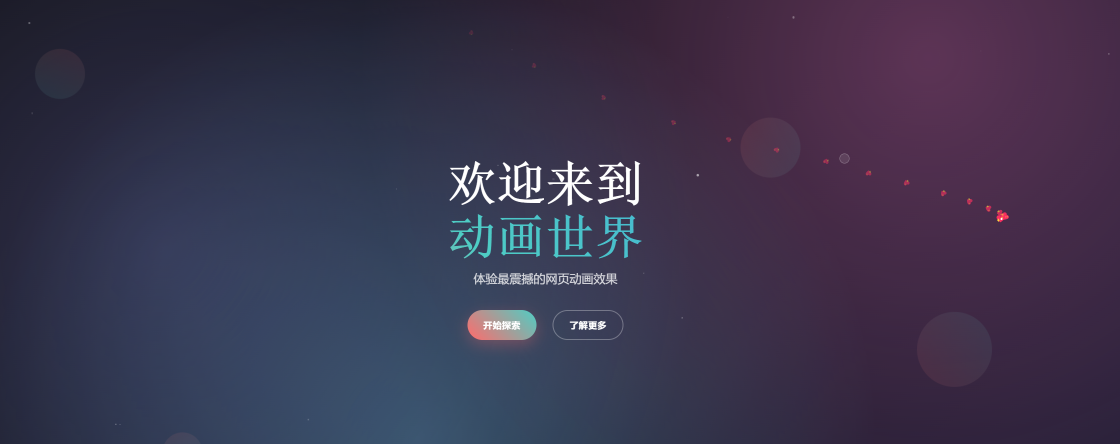
在当今的Web开发中,动画效果已经成为提升用户体验的重要元素。本文将带您从零开始,创建一个包含多种复杂动画效果的现代化网页,涵盖粒子系统、3D变换、视差滚动、鼠标跟随等高级技术。
🎯 项目概述
我们将创建一个名为"复杂动作网页"的展示页面,包含以下核心功能:
- ✨ 动态粒子背景系统
- 🎭 3D变换和透视效果
- 🖱️ 鼠标跟随和交互效果
- 📱 响应式设计和移动端适配
- 🎪 滚动触发动画
- 🎨 现代化UI设计
🛠️ 技术栈
- HTML5 - 语义化结构
- CSS3 - 动画、变换、渐变
- JavaScript ES6+ - 交互逻辑和动画控制
- Google Fonts - 现代化字体
📁 项目结构
复杂动作网页/
├── index.html          # 主页面文件
├── styles.css          # 样式文件
├── script.js           # JavaScript逻辑
└── CSDN教程文章.md     # 本文档
🚀 开始构建
1. HTML结构设计
首先创建基础的HTML结构:
<!DOCTYPE html>
<html lang="zh-CN">
<head>
    <meta charset="UTF-8">
    <meta name="viewport" content="width=device-width, initial-scale=1.0">
    <title>复杂动作网页 - 动画效果展示</title>
    <link rel="stylesheet" href="styles.css">
    <link href="https://fonts.googleapis.com/css2?family=Orbitron:wght@400;700;900&family=Roboto:wght@300;400;500;700&display=swap" rel="stylesheet">
</head>
<body>
    <!-- 粒子背景 -->
    <div id="particles-container"></div>

    <!-- 导航栏 -->
    <nav class="navbar">
        <div class="nav-container">
            <div class="nav-logo">
                <span class="logo-text">ANIMATE</span>
            </div>
            <ul class="nav-menu">
                <li class="nav-item"><a href="#home" class="nav-link">首页</a></li>
                <li class="nav-item"><a href="#about" class="nav-link">关于</a></li>
                <li class="nav-item"><a href="#gallery" class="nav-link">画廊</a></li>
                <li class="nav-item"><a href="#contact" class="nav-link">联系</a></li>
            </ul>
            <div class="hamburger">
                <span class="bar"></span>
                <span class="bar"></span>
                <span class="bar"></span>
            </div>
        </div>
    </nav>

    <!-- 主要内容区域 -->
    <main>
        <!-- 英雄区域 -->
        <section id="home" class="hero">
            <div class="hero-content">
                <h1 class="hero-title">
                    <span class="title-line">欢迎来到</span>
                    <span class="title-line">动画世界</span>
                </h1>
                <p class="hero-subtitle">体验最震撼的网页动画效果</p>
                <div class="hero-buttons">
                    <button class="btn btn-primary" data-text="开始探索">
                        <span>开始探索</span>
                    </button>
                    <button class="btn btn-secondary" data-text="了解更多">
                        <span>了解更多</span>
                    </button>
                </div>
            </div>
            <div class="hero-visual">
                <div class="floating-shapes">
                    <div class="shape shape-1"></div>
                    <div class="shape shape-2"></div>
                    <div class="shape shape-3"></div>
                    <div class="shape shape-4"></div>
                </div>
            </div>
        </section>

        <!-- 其他区域... -->
    </main>

    <!-- 鼠标跟随效果 -->
    <div class="cursor-follower"></div>
    <div class="cursor-dot"></div>

    <script src="script.js"></script>
</body>
</html>
2. CSS样式实现
2.1 基础样式和重置
/* 重置和基础样式 */
* {
    margin: 0;
    padding: 0;
    box-sizing: border-box;
}

html {
    scroll-behavior: smooth;
}

body {
    font-family: 'Roboto', sans-serif;
    background: linear-gradient(135deg, #0c0c0c 0%, #1a1a2e 50%, #16213e 100%);
    color: #ffffff;
    overflow-x: hidden;
    cursor: none;
}
2.2 粒子背景系统
/* 粒子背景 */
#particles-container {
    position: fixed;
    top: 0;
    left: 0;
    width: 100%;
    height: 100%;
    z-index: -1;
    background: radial-gradient(circle at 20% 50%, rgba(120, 119, 198, 0.3) 0%, transparent 50%),
                radial-gradient(circle at 80% 20%, rgba(255, 119, 198, 0.3) 0%, transparent 50%),
                radial-gradient(circle at 40% 80%, rgba(120, 219, 255, 0.3) 0%, transparent 50%);
}
2.3 鼠标跟随效果
/* 鼠标跟随效果 */
.cursor-follower {
    position: fixed;
    width: 20px;
    height: 20px;
    background: rgba(255, 255, 255, 0.1);
    border: 1px solid rgba(255, 255, 255, 0.3);
    border-radius: 50%;
    pointer-events: none;
    z-index: 9999;
    transition: transform 0.1s ease;
    backdrop-filter: blur(10px);
}

.cursor-dot {
    position: fixed;
    width: 4px;
    height: 4px;
    background: #ffffff;
    border-radius: 50%;
    pointer-events: none;
    z-index: 10000;
    transition: transform 0.05s ease;
}
2.4 动画关键帧
/* 渐变文字动画 */
@keyframes gradientShift {
    0%, 100% { background-position: 0% 50%; }
    50% { background-position: 100% 50%; }
}

/* 滑入动画 */
@keyframes slideInUp {
    to {
        opacity: 1;
        transform: translateY(0);
    }
}

/* 浮动动画 */
@keyframes float {
    0%, 100% { transform: translateY(0px) rotate(0deg); }
    50% { transform: translateY(-20px) rotate(180deg); }
}

/* 3D立方体旋转 */
@keyframes cubeRotate {
    0% { transform: rotateX(0deg) rotateY(0deg); }
    100% { transform: rotateX(360deg) rotateY(360deg); }
}
3. JavaScript交互逻辑
3.1 粒子系统实现
// 粒子系统
function initParticleSystem() {
    const container = document.getElementById('particles-container');
    const particleCount = 50;

    for (let i = 0; i < particleCount; i++) {
        createParticle(container);
    }
}

function createParticle(container) {
    const particle = document.createElement('div');
    particle.className = 'particle';

    // 随机属性
    const size = Math.random() * 4 + 1;
    const x = Math.random() * window.innerWidth;
    const y = Math.random() * window.innerHeight;
    const duration = Math.random() * 20 + 10;
    const delay = Math.random() * 5;

    // 设置样式
    particle.style.cssText = `
        position: absolute;
        width: ${size}px;
        height: ${size}px;
        background: rgba(255, 255, 255, ${Math.random() * 0.5 + 0.1});
        border-radius: 50%;
        left: ${x}px;
        top: ${y}px;
        pointer-events: none;
        animation: floatParticle ${duration}s linear infinite;
        animation-delay: ${delay}s;
    `;

    container.appendChild(particle);
}
3.2 鼠标跟随效果
// 鼠标跟随效果
function initCursorFollower() {
    const follower = document.querySelector('.cursor-follower');
    const dot = document.querySelector('.cursor-dot');
    let mouseX = 0, mouseY = 0;
    let followerX = 0, followerY = 0;

    // 鼠标移动事件
    document.addEventListener('mousemove', (e) => {
        mouseX = e.clientX;
        mouseY = e.clientY;

        // 立即更新小点
        dot.style.left = mouseX + 'px';
        dot.style.top = mouseY + 'px';
    });

    // 平滑跟随动画
    function animateFollower() {
        followerX += (mouseX - followerX) * 0.1;
        followerY += (mouseY - followerY) * 0.1;

        follower.style.left = followerX + 'px';
        follower.style.top = followerY + 'px';

        requestAnimationFrame(animateFollower);
    }
    animateFollower();
}
3.3 滚动动画控制
// 滚动动画
function initScrollAnimations() {
    const observerOptions = {
        threshold: 0.1,
        rootMargin: '0px 0px -50px 0px'
    };

    const observer = new IntersectionObserver((entries) => {
        entries.forEach(entry => {
            if (entry.isIntersecting) {
                entry.target.classList.add('visible');

                // 特殊处理画廊项目
                if (entry.target.classList.contains('gallery-item')) {
                    const delay = Array.from(entry.target.parentNode.children).indexOf(entry.target) * 0.2;
                    entry.target.style.animationDelay = delay + 's';
                }
            }
        });
    }, observerOptions);

    // 观察需要动画的元素
    const animatedElements = document.querySelectorAll('.fade-in-up, .gallery-item, .stat-item, .info-item');
    animatedElements.forEach(el => observer.observe(el));
}
3.4 数字计数动画
// 数字计数动画
function initCounterAnimations() {
    const counters = document.querySelectorAll('.stat-number');

    const counterObserver = new IntersectionObserver((entries) => {
        entries.forEach(entry => {
            if (entry.isIntersecting) {
                const counter = entry.target;
                const target = parseInt(counter.getAttribute('data-target'));
                const duration = 2000; // 2秒
                const increment = target / (duration / 16); // 60fps
                let current = 0;

                const updateCounter = () => {
                    current += increment;
                    if (current < target) {
                        counter.textContent = Math.floor(current);
                        requestAnimationFrame(updateCounter);
                    } else {
                        counter.textContent = target;
                    }
                };

                updateCounter();
                counterObserver.unobserve(counter);
            }
        });
    }, { threshold: 0.5 });

    counters.forEach(counter => counterObserver.observe(counter));
}
🎨 核心动画技术解析
1. CSS3动画技术
1.1 关键帧动画
@keyframes slideInUp {
    from {
        opacity: 0;
        transform: translateY(50px);
    }
    to {
        opacity: 1;
        transform: translateY(0);
    }
}
1.2 3D变换
.gallery-card {
    transform-style: preserve-3d;
    transition: transform 0.6s ease;
}

.gallery-card:hover {
    transform: rotateY(180deg);
}
1.3 渐变动画
.logo-text {
    background: linear-gradient(45deg, #ff6b6b, #4ecdc4, #45b7d1);
    background-size: 200% 200%;
    -webkit-background-clip: text;
    -webkit-text-fill-color: transparent;
    animation: gradientShift 3s ease-in-out infinite;
}
2. JavaScript动画控制
2.1 性能优化
// 节流函数
function throttle(func, limit) {
    let inThrottle;
    return function() {
        const args = arguments;
        const context = this;
        if (!inThrottle) {
            func.apply(context, args);
            inThrottle = true;
            setTimeout(() => inThrottle = false, limit);
        }
    }
}
2.2 视差效果
// 视差效果
function initParallaxEffects() {
    const parallaxElements = document.querySelectorAll('.floating-shapes .shape');

    window.addEventListener('scroll', () => {
        const scrolled = window.pageYOffset;
        const rate = scrolled * -0.5;

        parallaxElements.forEach((element, index) => {
            const speed = (index + 1) * 0.1;
            element.style.transform = `translateY(${rate * speed}px) rotate(${scrolled * 0.1}deg)`;
        });
    });
}
📱 响应式设计
移动端适配
@media (max-width: 768px) {
    .nav-menu {
        position: fixed;
        left: -100%;
        top: 70px;
        flex-direction: column;
        background: rgba(0, 0, 0, 0.9);
        width: 100%;
        text-align: center;
        transition: 0.3s;
        padding: 2rem 0;
    }

    .nav-menu.active {
        left: 0;
    }

    .hamburger {
        display: flex;
    }

    .about-content,
    .contact-content {
        grid-template-columns: 1fr;
        gap: 2rem;
    }
}
🚀 性能优化技巧
1. 动画性能优化
- 使用
transform和opacity进行动画 - 避免触发重排和重绘的属性
- 使用
will-change属性预告浏览器 - 合理使用
requestAnimationFrame
2. 事件优化
// 优化滚动事件
const optimizedScrollHandler = throttle(() => {
    // 滚动相关的性能敏感操作
}, 16); // 60fps

window.addEventListener('scroll', optimizedScrollHandler);
3. 内存管理
// 页面可见性变化处理
document.addEventListener('visibilitychange', () => {
    if (document.hidden) {
        // 页面隐藏时暂停动画
        document.body.style.animationPlayState = 'paused';
    } else {
        // 页面显示时恢复动画
        document.body.style.animationPlayState = 'running';
    }
});
🎯 项目特色功能
1. 粒子系统
- 动态生成50个粒子
- 随机大小、位置、透明度
- 流畅的浮动动画
2. 3D效果
- 卡片翻转动画
- 立方体旋转演示
- 透视变换效果
3. 交互体验
- 鼠标跟随效果
- 悬停动画
- 点击波纹效果
4. 滚动动画
- 元素进入视口触发
- 数字计数动画
- 视差滚动效果
📚 学习要点总结
CSS3动画核心概念
- 关键帧动画 -
@keyframes定义动画序列 - 变换属性 -
transform实现位移、旋转、缩放 - 过渡效果 -
transition平滑状态变化 - 3D变换 -
transform-style: preserve-3d启用3D空间
JavaScript动画控制
- Intersection Observer - 滚动触发动画
- requestAnimationFrame - 流畅动画循环
- 事件节流 - 性能优化技巧
- DOM操作优化 - 减少重排重绘
用户体验设计
- 响应式设计 - 适配各种设备
- 性能优化 - 流畅的动画体验
- 无障碍支持 - 键盘导航和语义化
- 视觉层次 - 合理的动画时序
🔧 扩展建议
1. 添加更多动画效果
- 页面切换动画
- 加载动画
- 错误状态动画
2. 集成动画库
- GSAP (GreenSock)
- Lottie动画
- Three.js 3D效果
3. 性能监控
- 动画帧率监控
- 内存使用优化
- 用户体验指标
📖 结语
通过这个项目,我们学习了现代Web动画的核心技术,包括CSS3动画、JavaScript交互控制、性能优化等。这些技术不仅能够提升用户体验,也是现代前端开发的重要技能。
希望这篇文章能够帮助您深入理解Web动画的实现原理,并在实际项目中应用这些技术。如果您有任何问题或建议,欢迎在评论区讨论!
项目源码: [GitHub链接]
在线演示: [演示链接]
技术交流: 欢迎关注我的CSDN博客获取更多前端技术分享
本文原创,转载请注明出处。如有技术问题,欢迎交流讨论!

码道开发者社区,聚焦华为云码道 CodeArts 代码智能体,沉淀 Agent、Skill、鸿蒙开发实战内容,供开发者查阅资料、交流技术、分享工程实践
更多推荐

 6
6 0
0- 0


 已为社区贡献1条内容

所有评论(0)