pink老师html5+css3day03
·
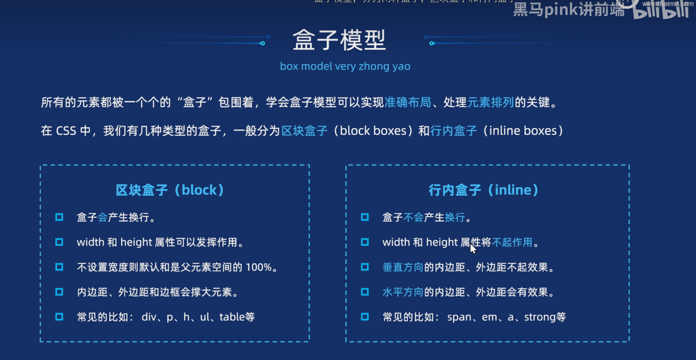
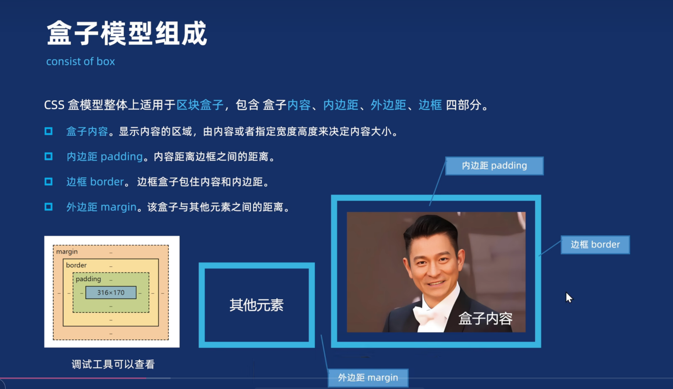
盒子模型
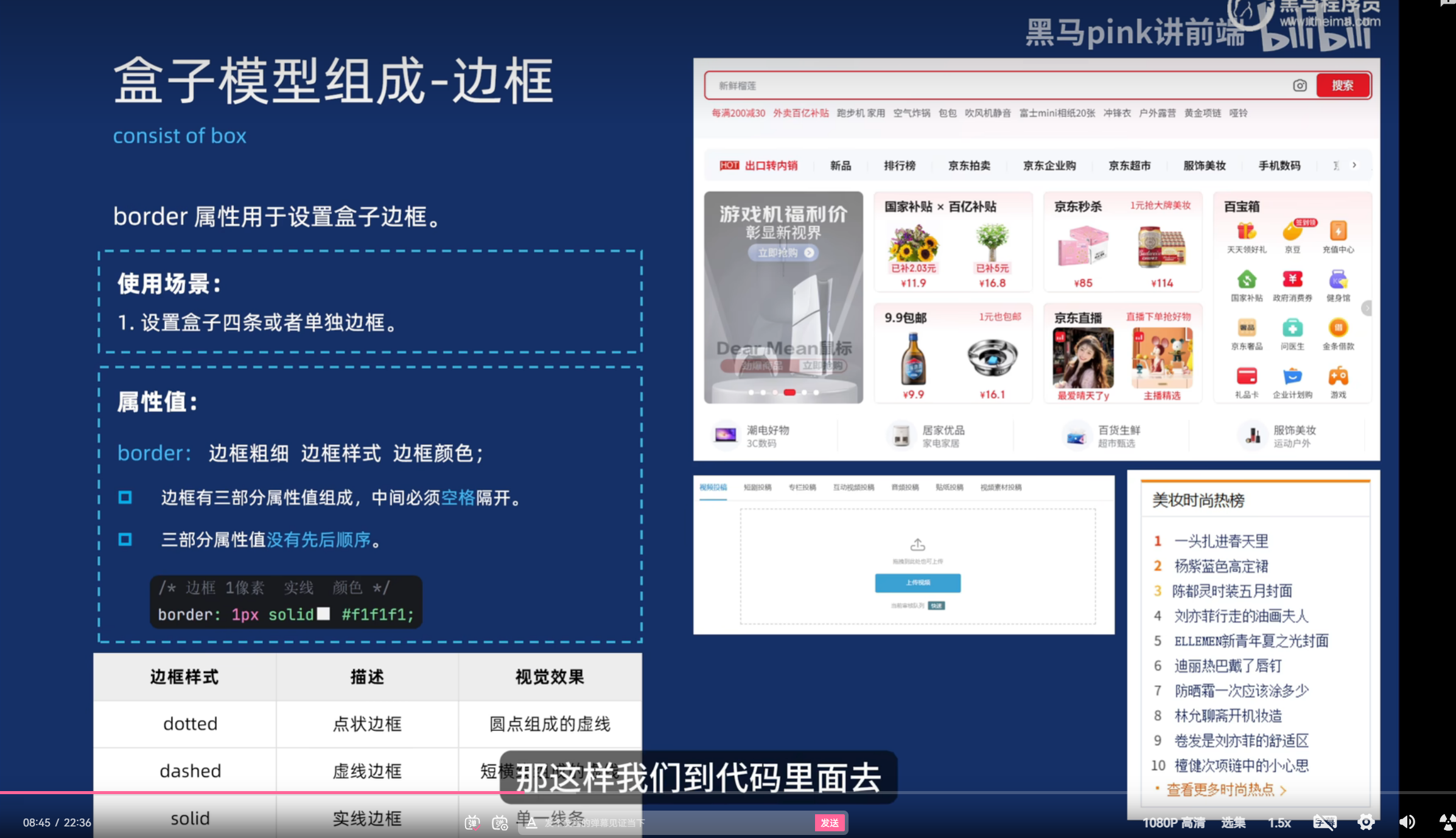
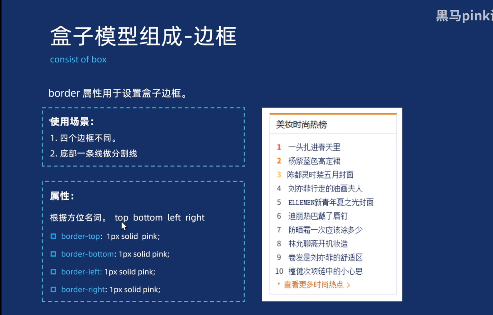
边框
<!DOCTYPE html>
<html lang="en">

<head>
  <meta charset="UTF-8">
  <meta name="viewport" content="width=device-width, initial-scale=1.0">
  <title>Document</title>
  <style>
    div[class*="box"] {
      width: 200px;
      height: 200px;
      margin: 20px;
    }

    .box1 {
      border: 1px solid red;
    }

    .box2 {
      border: 1px dashed red;
    }

    .box3 {
      border: 1px dotted red;
    }

    .box4 {
      border-top: 1px solid red;
      border-right: 1px dashed gray;
      border-bottom: 1px dotted blue;
      border-left: 1px solid green;
    }

    .box5 {
      border: 1px solid #d9e0ee;
      border-top: 3px solid #ff8400;

    }
  </style>
</head>

<body>
  <div class="box1">实现边框</div>
  <div class="box2">虚线边框</div>
  <div class="box3">点状边框</div>
  <div class="box4">不同边框1</div>
  <div class="box5">不同边框2</div>
</body>

</html>
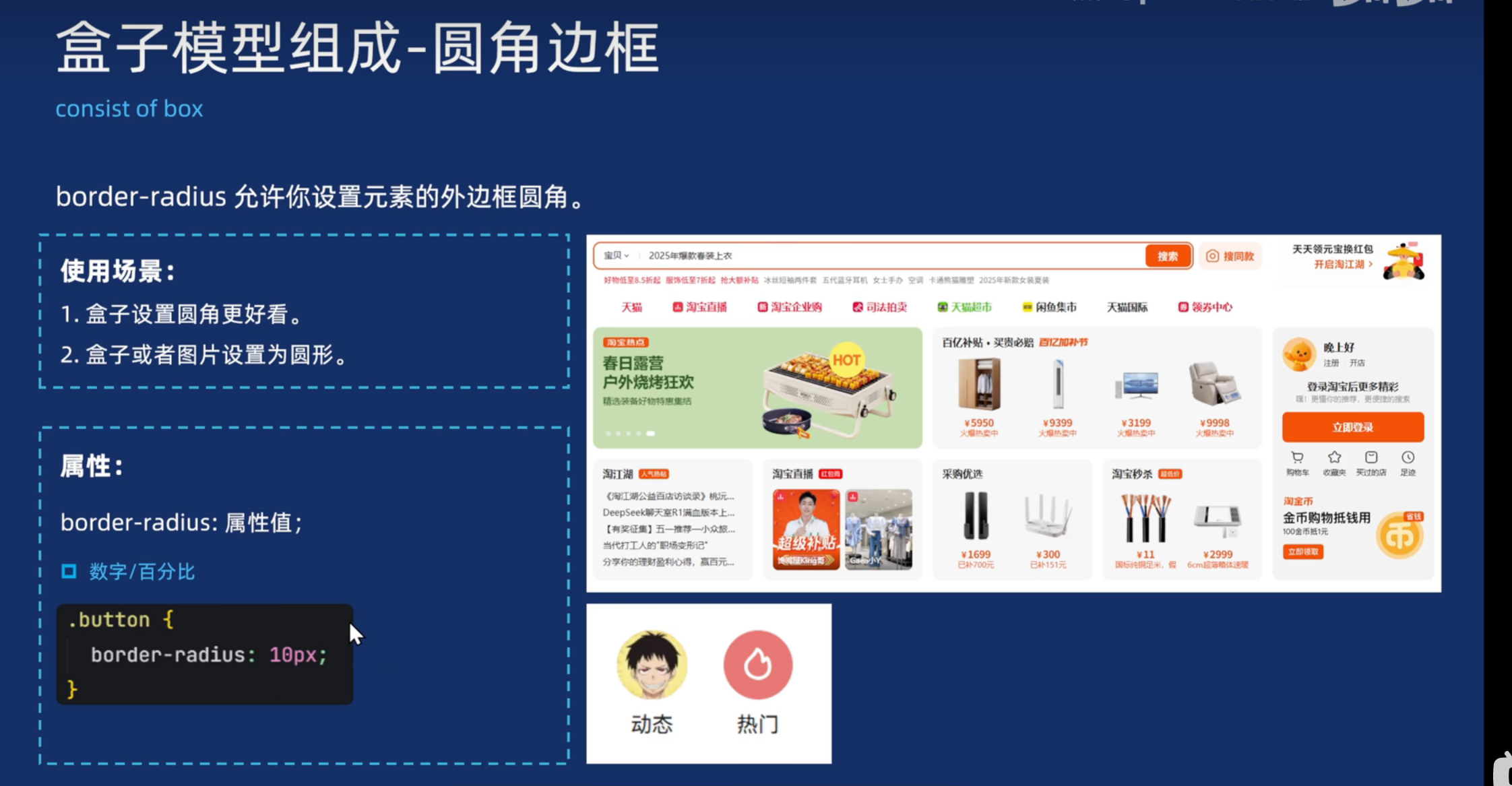
圆形:高宽设置一样,border-radius设置50%
胶囊:设置min(w,h)的一半
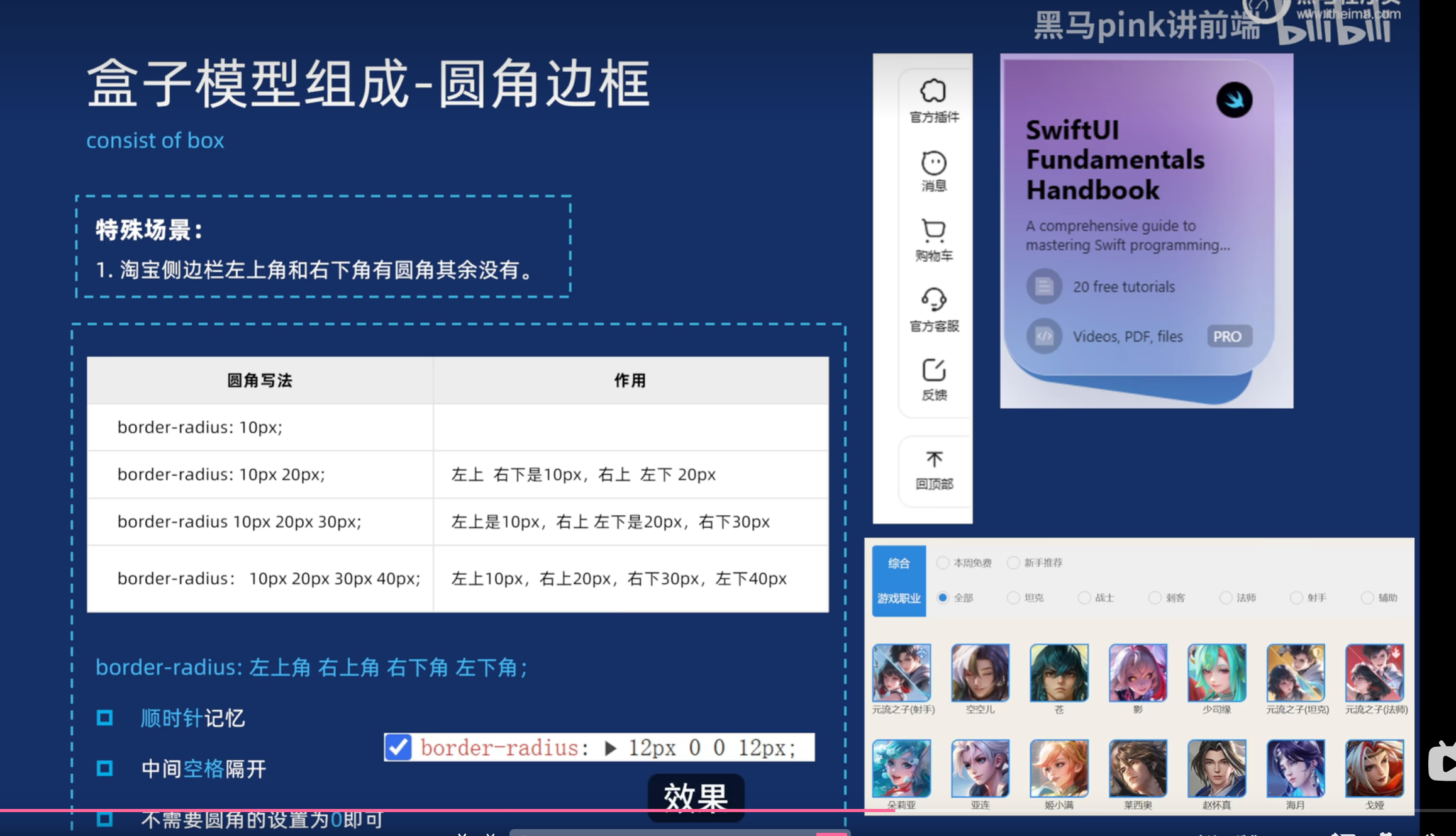
<!DOCTYPE html>
<html lang="en">

<head>
  <meta charset="UTF-8">
  <meta name="viewport" content="width=device-width, initial-scale=1.0">
  <title>Document</title>
  <style>
    .box1 {
      width: 200px;
      height: 200px;
      background-color: pink;
      border-radius: 50%;
      text-align: center;
    }

    .box2 {
      width: 200px;
      height: 100px;
      background-color: pink;
      border-radius: 10px;
      text-align: center;
    }

    .box3 {
      width: 100px;
      height: 50px;
      background-color: pink;
      border-radius: 25px;
      text-align: center;
    }

    .box4 {
      width: 200px;
      height: 100px;
      background-color: pink;
      border-radius: 10px;
      text-align: center;
    }

    .box5 {
      width: 200px;
      height: 100px;
      background-color: pink;
      border-radius: 10px 20px;
      text-align: center;
    }

    .box6 {
      width: 200px;
      height: 100px;
      background-color: pink;
      border-radius: 10px 20px 30px;
      text-align: center;
    }

    .box7 {
      width: 200px;
      height: 100px;
      background-color: pink;
      border-radius: 10px 20px 30px 40px;
      text-align: center;
    }

    .box8 {
      border-radius: 50%;
    }

    .box9 {
      border-radius: 10px 0;
      border: 2px solid skyblue;
    }
  </style>
</head>

<body>
  <div class="box1">圆形边框</div>
  <div class="box2">矩形圆角边框</div>
  <div class="box3">胶囊边框</div>
  <div class="box4">一个值</div>
  <div class="box5">两个值</div>
  <div class="box6">三个值</div>
  <div class="box7">四个值</div>
  <img src="img/w1.webp" alt="" class="box8">
  <img src="img/w3.webp" alt="" class="box9">


</body>

</html>
内边距
<!DOCTYPE html>
<html lang="en">

<head>
  <meta charset="UTF-8">
  <meta name="viewport" content="width=device-width, initial-scale=1.0">
  <title>Document</title>
  <style>
    .box {
      width: 200px;
      height: 200px;
      margin: 20px;
      padding: 20px;
      border: 1px solid red;
    }

    .box1 {
      width: 200px;
      height: 200px;
      border: 1px solid blue;
      padding-top: 10px;
      padding-left: 20px;
      padding-bottom: 30px;
      padding-right: 40px;
    }
  </style>
</head>

<body>
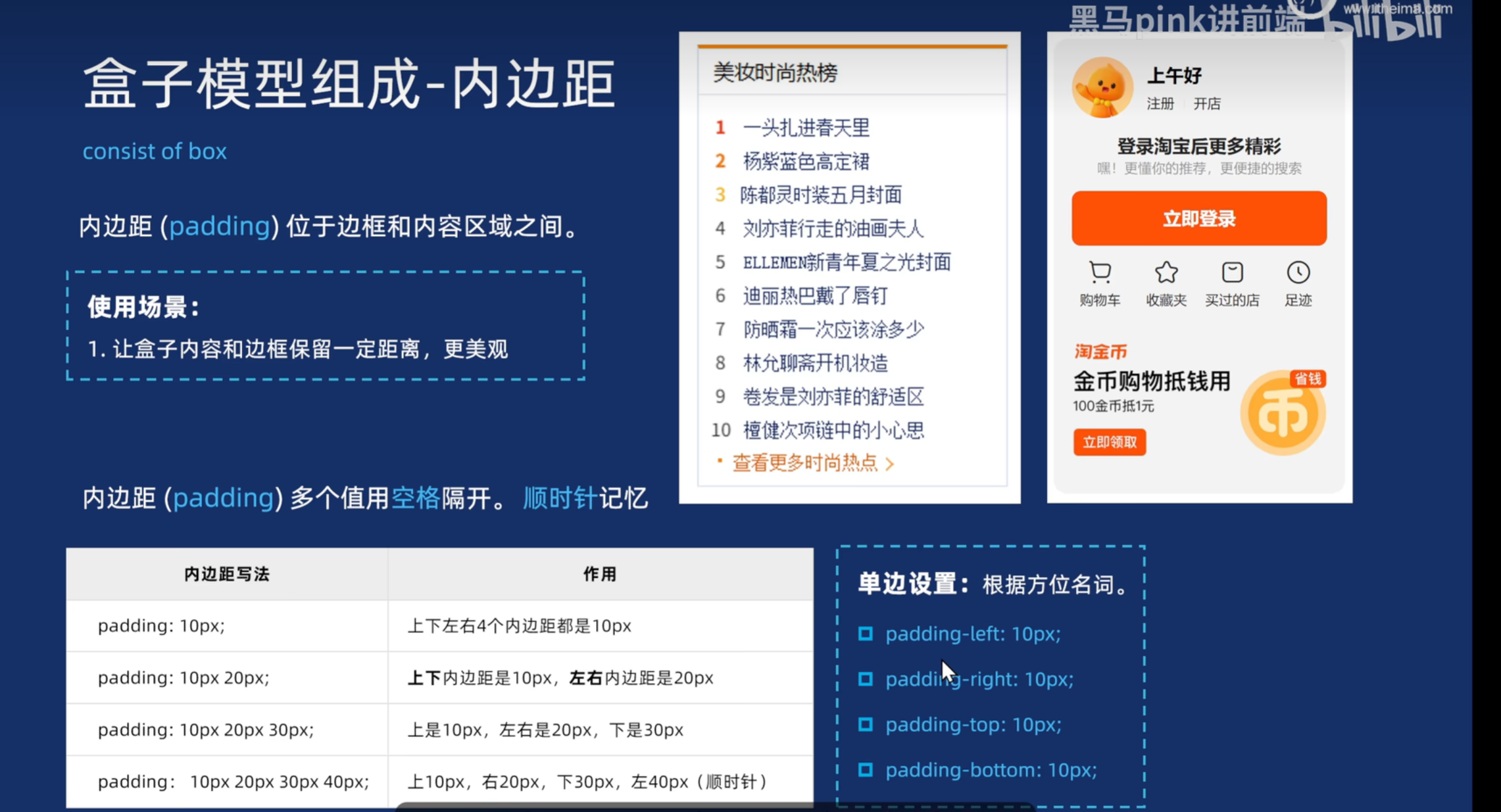
  <div class="box">一个值表示上下左右,两个值表示上下 左右,三个值表示上 左右 下,四个值表示上 右 下 左</div>
  <div class="box1">美妆</div>
</body>

</html>
外边距
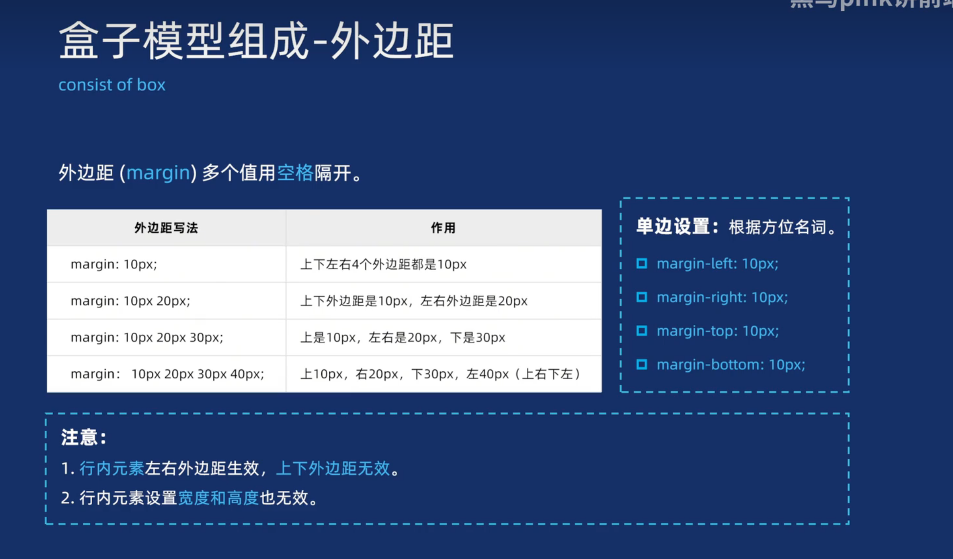
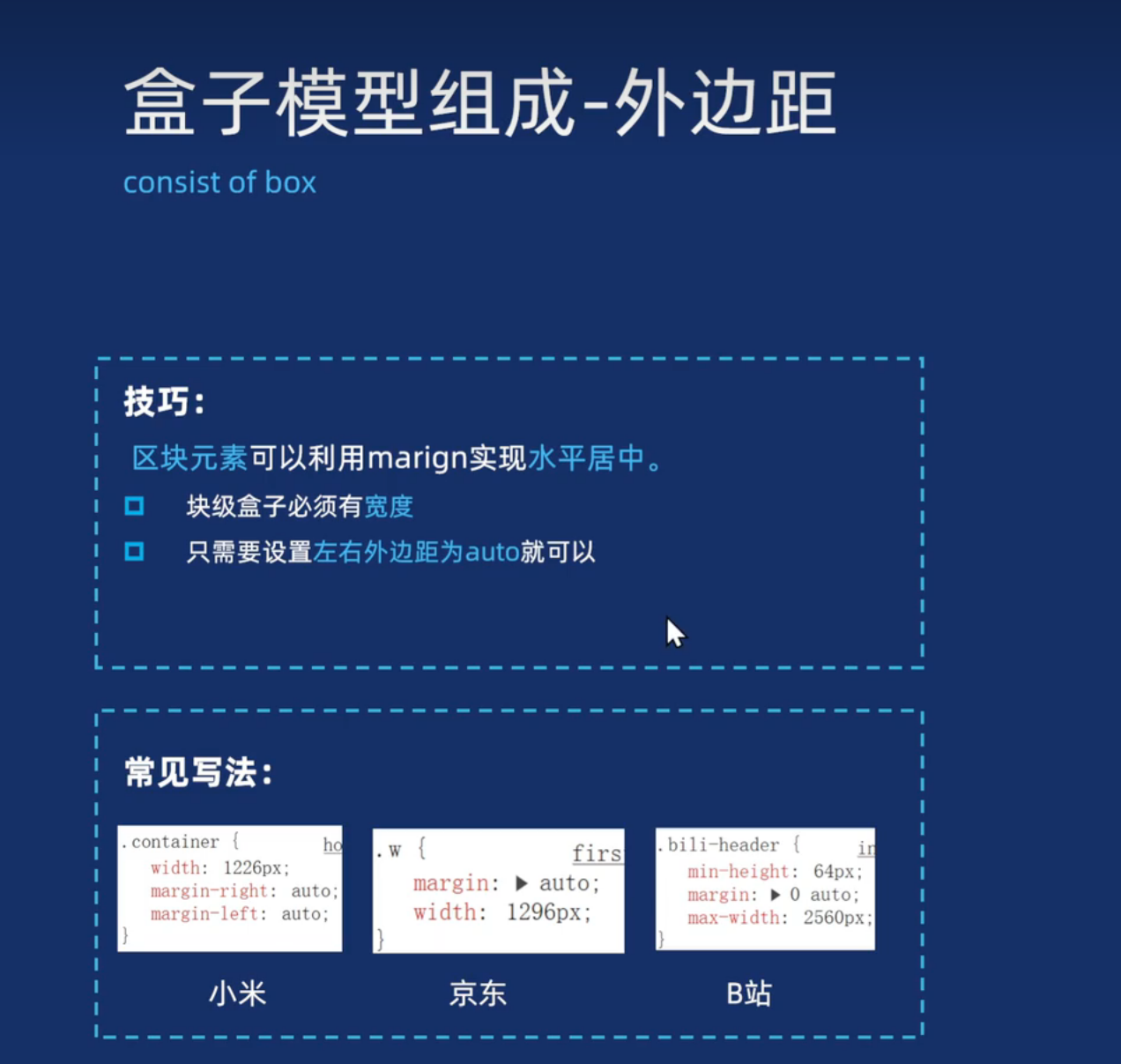
这个是浏览器特
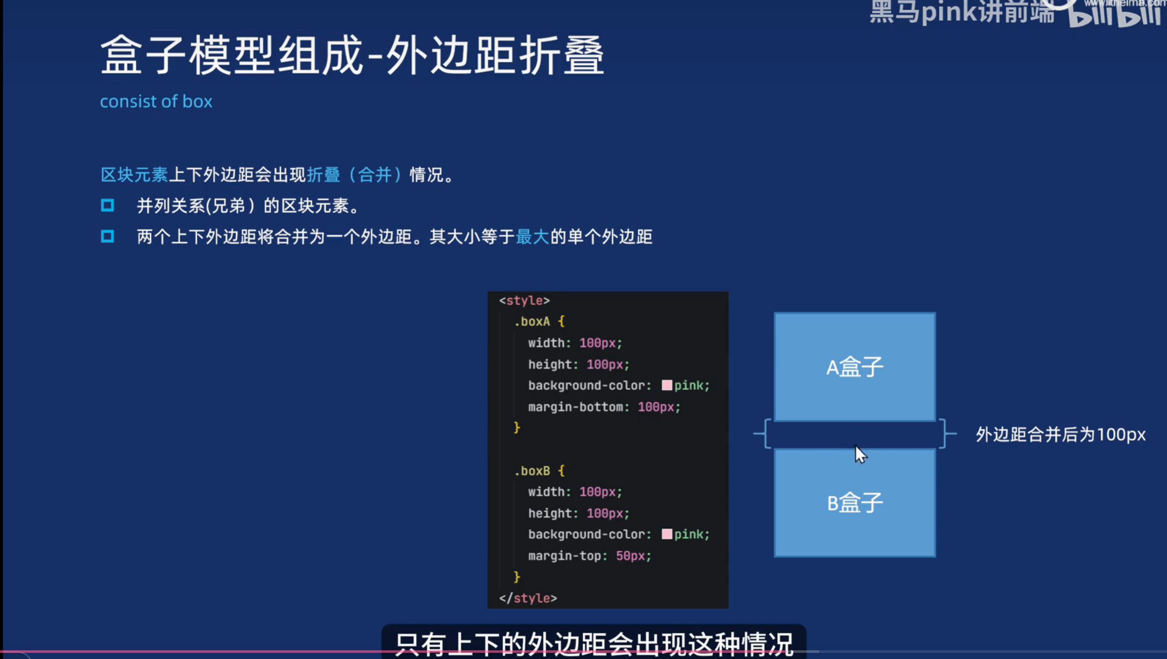
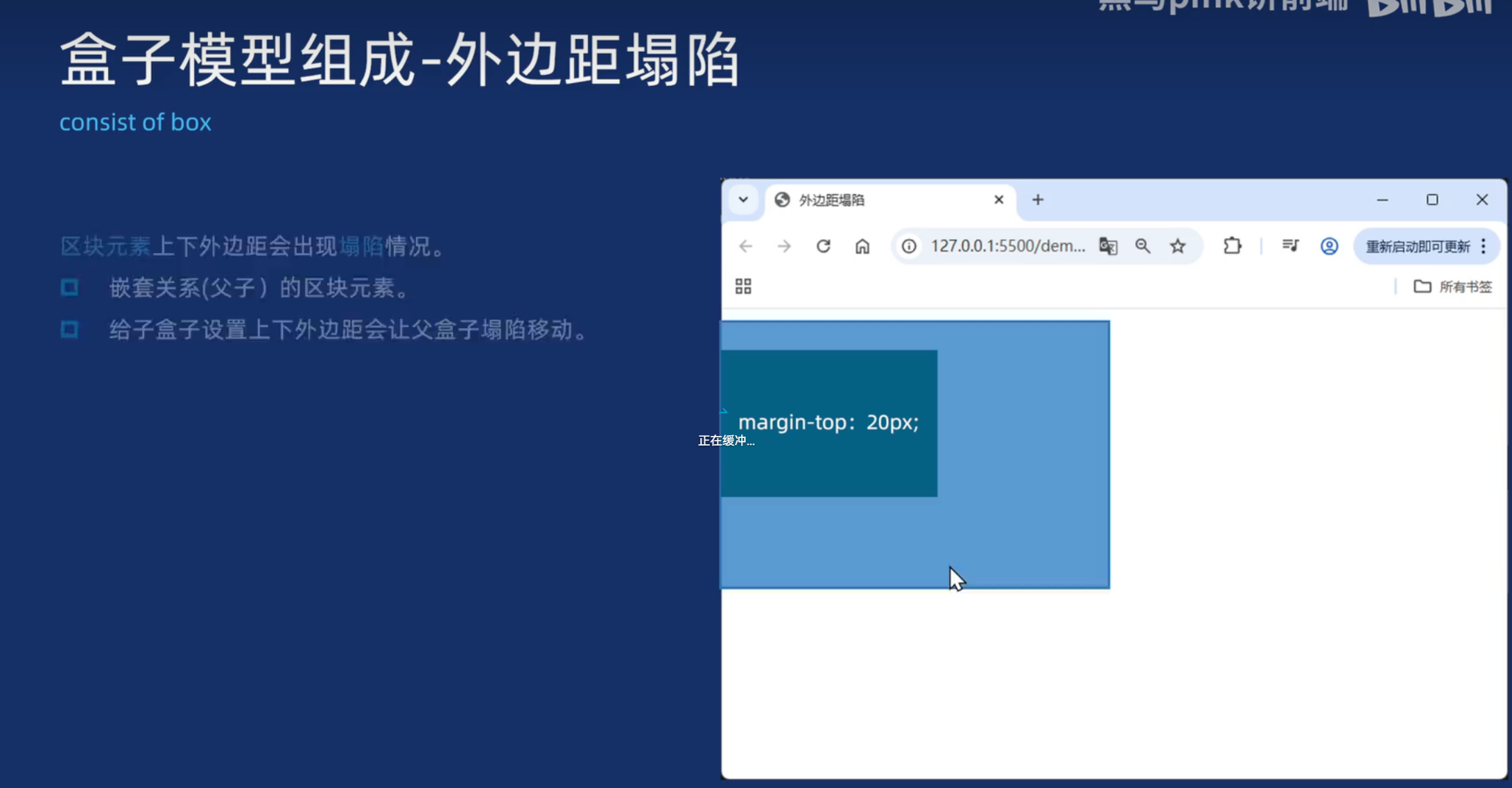
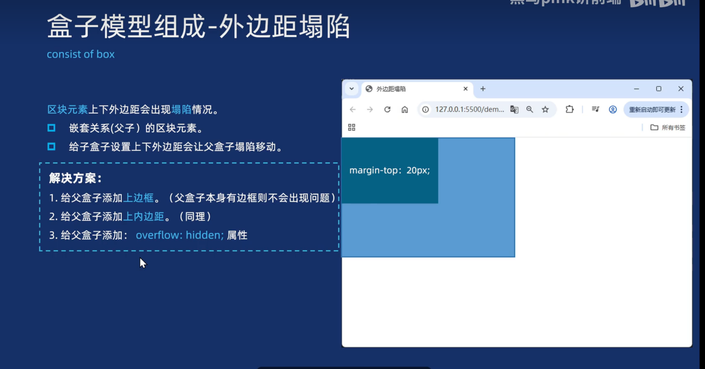
尺寸计算
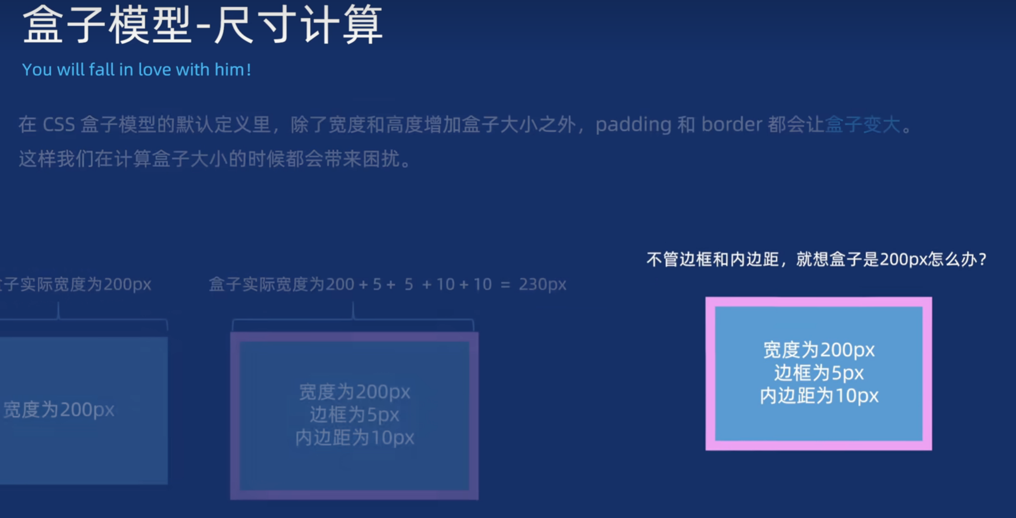
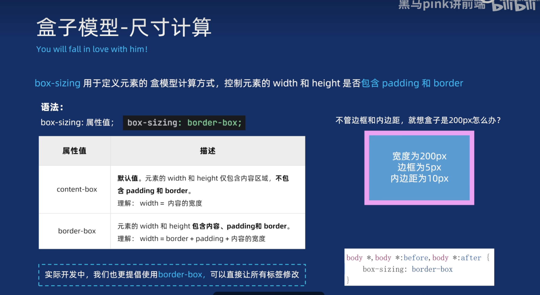
<!DOCTYPE html>
<html lang="en">

<head>
  <meta charset="UTF-8">
  <meta name="viewport" content="width=device-width, initial-scale=1.0">
  <title>Document</title>

  <style>
    * {
      margin: 0;
      padding: 0;
      box-sizing: border-box;
    }

    .box1 {
      width: 200px;
      height: 200px;
      border: 10px solid blue;

      padding-right: 40px;
    }
  </style>
</head>

<body>
  <div class="box1">11</div>
</body>

</html>
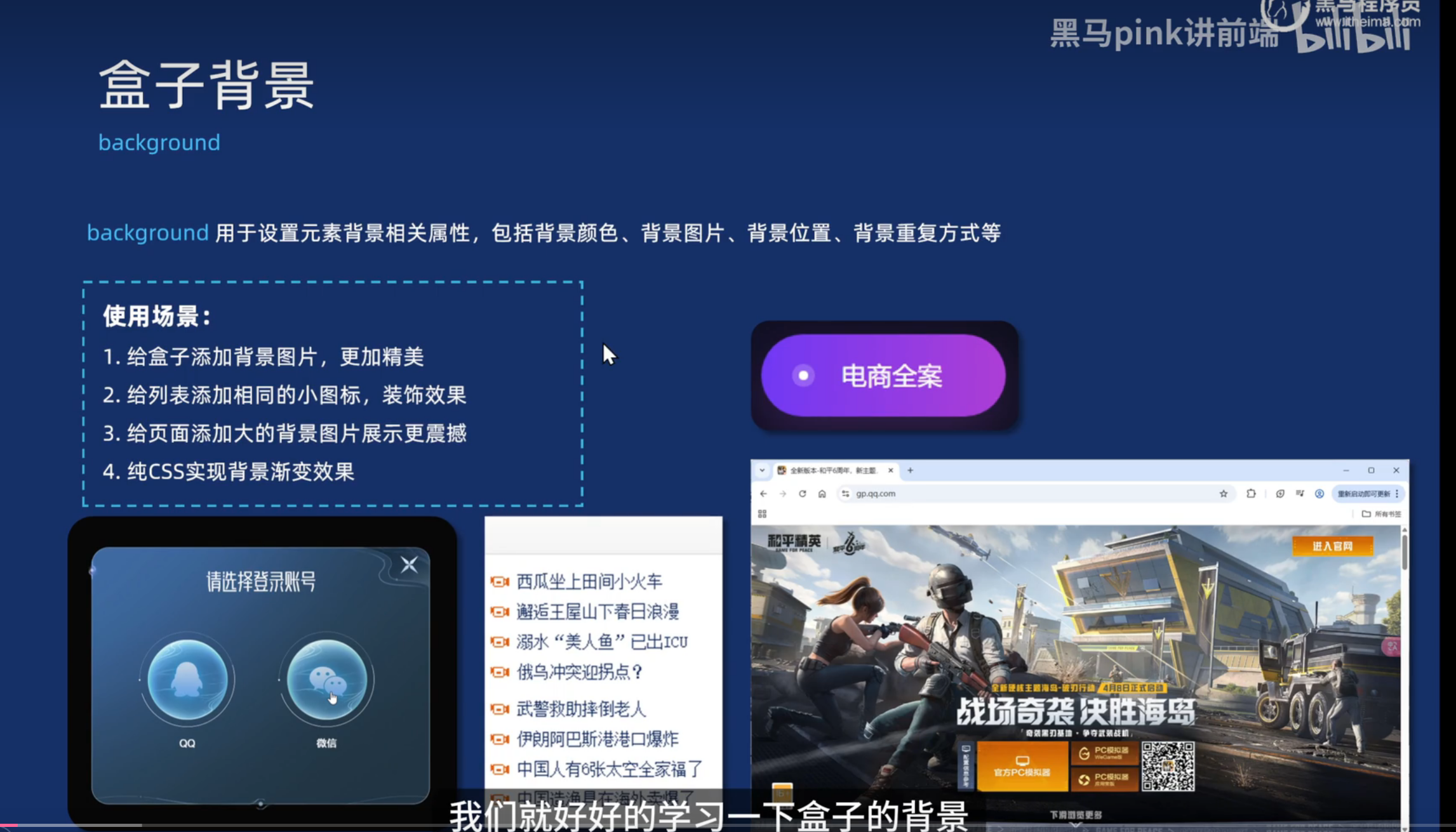
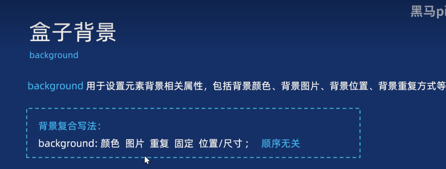
盒子背景
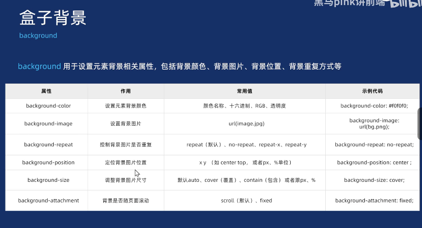
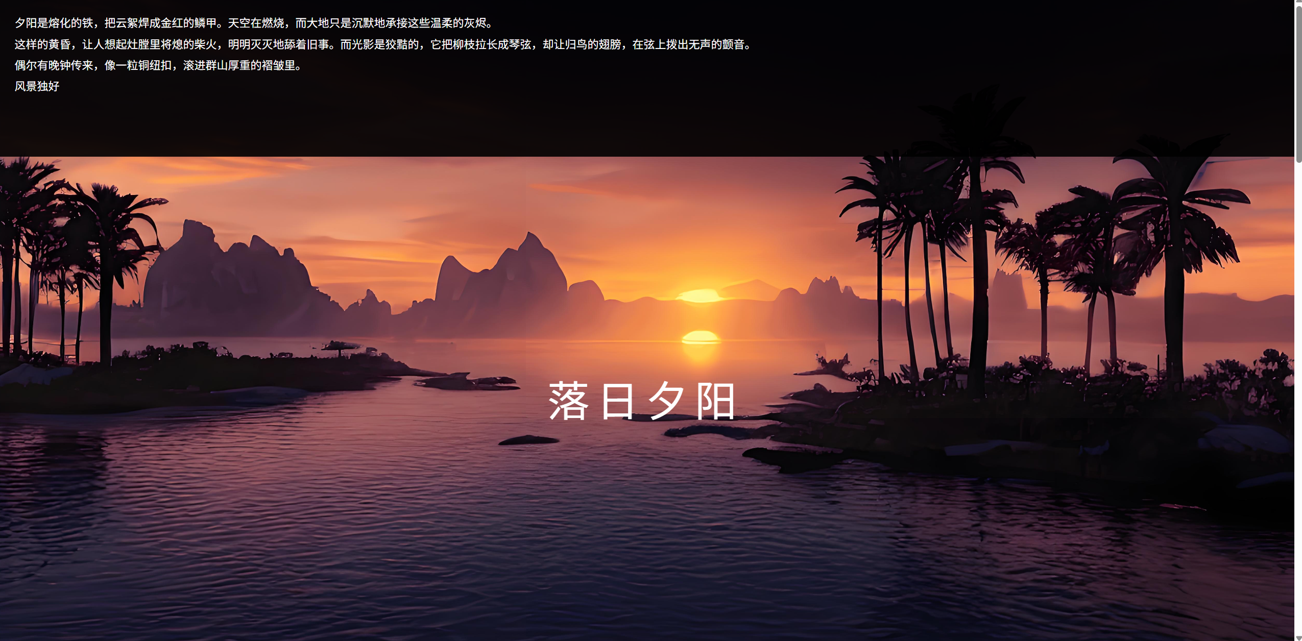
视觉滚动案例:
<!DOCTYPE html>
<html lang="en">

<head>
  <meta charset="UTF-8">
  <meta name="viewport" content="width=device-width, initial-scale=1.0">
  <title>Document</title>
  <style>
    * {
      margin: 0;
      padding: 0;
      box-sizing: border-box;
    }

    html,
    body {
      width: 100%;
      height: 100%;
    }

    section[class^="section"] {
      width: 100%;
      height: 100%;
    }

    .section1 {
      background: url(./img/bg1.jpg) no-repeat center center/cover;
    }

    .section2 {
      background: url(./img/bg2.jpg) no-repeat center center/cover;
    }

    .section3 {
      background: url(./img/bg3.jpg) no-repeat center center/cover;
    }

    .section4 {
      background: url(./img/bg4.jpg) no-repeat center center/cover;
    }

    .content {
      width: 100%;
      height: 25%;
      background-color: rgba(0, 0, 0, 0.9);
      color: #fff;
      line-height: 30px;
      font-size: 16px;
      padding: 25px;
    }

    section[class^="section"] h2 {
      text-align: center;
      font-weight: 400;
      font-size: 60px;
      margin-top: 300px;
      letter-spacing: 10px;
      color: #fff;
    }
  </style>
</head>

<body>
  <section class="section1">
    <div class="content">
      <p>夕阳是熔化的铁,把云絮焊成金红的鳞甲。天空在燃烧,而大地只是沉默地承接这些温柔的灰烬。</p>

      <p>这样的黄昏,让人想起灶膛里将熄的柴火,明明灭灭地舔着旧事。而光影是狡黠的,它把柳枝拉长成琴弦,却让归鸟的翅膀,在弦上拨出无声的颤音。</p>

      <p>偶尔有晚钟传来,像一粒铜纽扣,滚进群山厚重的褶皱里。</p>

      <p>风景独好</p>
    </div>
    <h2>落日夕阳</h2>
  </section>
  <section class="section2">
    <div class="content">
      <p>夕阳是熔化的铁,把云絮焊成金红的鳞甲。天空在燃烧,而大地只是沉默地承接这些温柔的灰烬。</p>

      <p>这样的黄昏,让人想起灶膛里将熄的柴火,明明灭灭地舔着旧事。而光影是狡黠的,它把柳枝拉长成琴弦,却让归鸟的翅膀,在弦上拨出无声的颤音。</p>

      <p>偶尔有晚钟传来,像一粒铜纽扣,滚进群山厚重的褶皱里。</p>

      <p>风景独好</p>
    </div>
    <h2>落日夕阳</h2>
  </section>
  <section class="section3">
    <div class="content">
      <p>夕阳是熔化的铁,把云絮焊成金红的鳞甲。天空在燃烧,而大地只是沉默地承接这些温柔的灰烬。</p>

      <p>这样的黄昏,让人想起灶膛里将熄的柴火,明明灭灭地舔着旧事。而光影是狡黠的,它把柳枝拉长成琴弦,却让归鸟的翅膀,在弦上拨出无声的颤音。</p>

      <p>偶尔有晚钟传来,像一粒铜纽扣,滚进群山厚重的褶皱里。</p>

      <p>风景独好</p>
    </div>
    <h2>落日夕阳</h2>
  </section>
  <section class="section4">
    <div class="content">
      <p>夕阳是熔化的铁,把云絮焊成金红的鳞甲。天空在燃烧,而大地只是沉默地承接这些温柔的灰烬。</p>

      <p>这样的黄昏,让人想起灶膛里将熄的柴火,明明灭灭地舔着旧事。而光影是狡黠的,它把柳枝拉长成琴弦,却让归鸟的翅膀,在弦上拨出无声的颤音。</p>

      <p>偶尔有晚钟传来,像一粒铜纽扣,滚进群山厚重的褶皱里。</p>

      <p>风景独好</p>
    </div>
    <h2>落日夕阳</h2>
  </section>
</body>

</html>
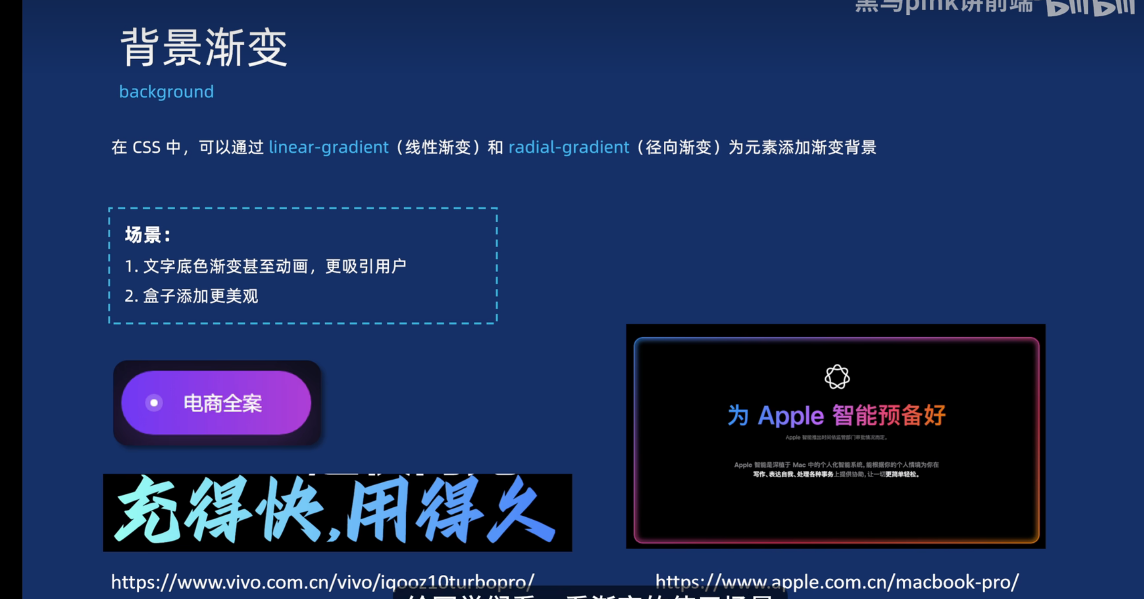
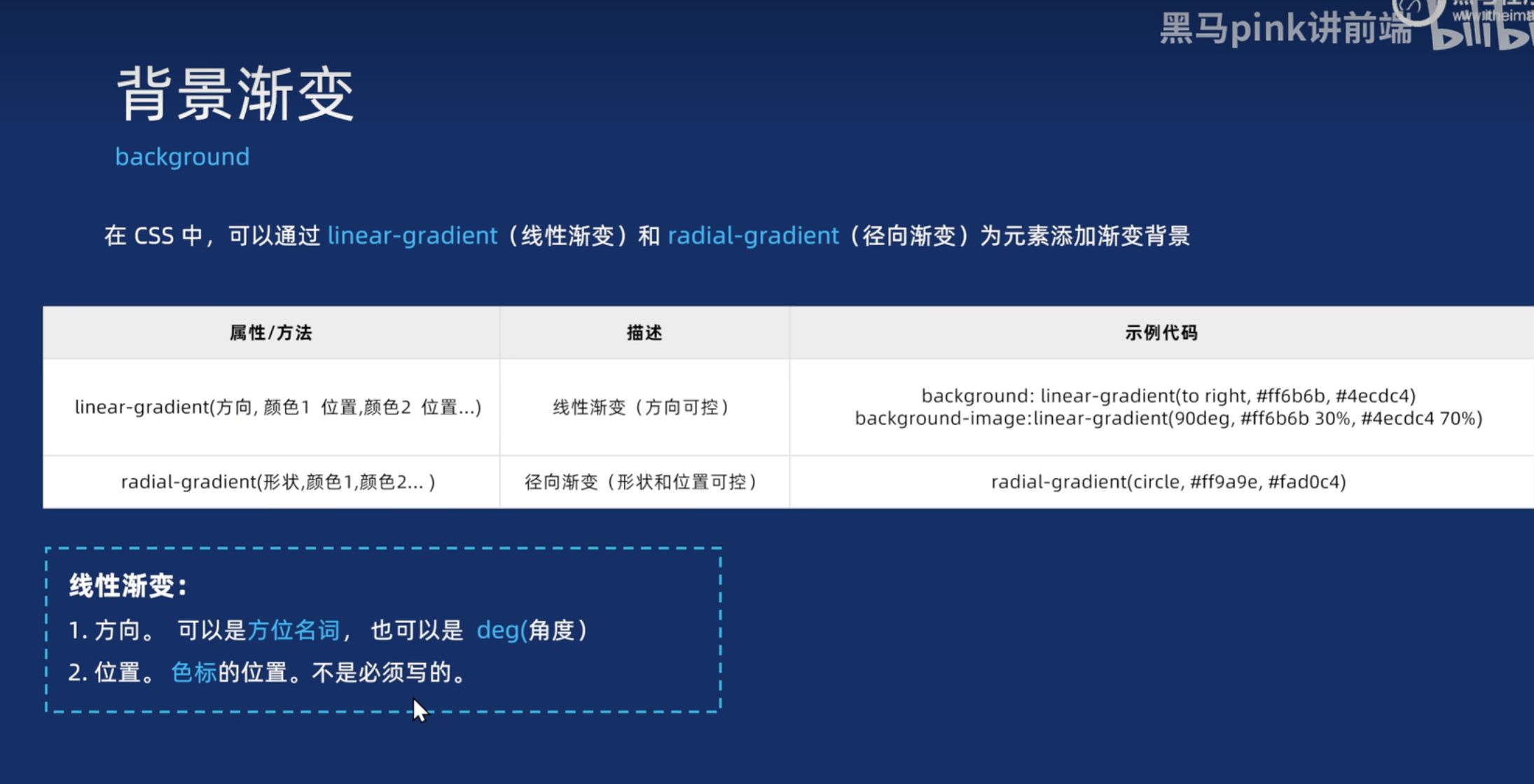
背景渐变
<!DOCTYPE html>
<html lang="en">

<head>
  <meta charset="UTF-8">
  <meta name="viewport" content="width=device-width, initial-scale=1.0">
  <title>背景渐变</title>
  <style>
    .box {
      width: 300px;
      height: 200px;

      /* background-color: pink; */
      /* background: linear-gradient(to top, pink, red); */
      /* deg 角度  90deg 就是 90度 */
      /* background: linear-gradient(90deg, pink, red); */
      /* 位置 是色标的位置 */
      /* background: linear-gradient(90deg, pink 50%, red 50%); */
      /* background: linear-gradient(180deg, #3ECEC5D8 0%, #26BCC6 100%); */
      background-image: linear-gradient(180deg, #3ECEC5D8 0%, #26BCC6 100%);


    }

    .text {
      font-size: 30px;
      font-weight: 700;
      /* 渐变背景文字 */
      background-image: linear-gradient(97deg, #0096FF, #BB64FF 42%, #F2416B 74%, #EB7500);
      /* -webkit- 前缀  谷歌浏览器老版本的兼容性写法 */
      -webkit-background-clip: text;
      /* 背景裁剪 以文字的形式裁剪 */
      background-clip: text;
      /* 文本填充颜色 为透明 */
      -webkit-text-fill-color: transparent;
    }

    /* 添加按钮渐变样式 */
    .gradient-btn {
      background: linear-gradient(45deg, #ff6b6b, #4ecdc4);
      border: none;
      color: white;
      padding: 10px 20px;
      border-radius: 5px;
      cursor: pointer;
      font-size: 16px;
    }
  </style>
</head>

<body>
  <div class="box"></div>
  <div class="text">我是渐变的文字,你喜欢吗?</div>
  <button class="gradient-btn">搜索</button>
</body>

</html>
盒子影子
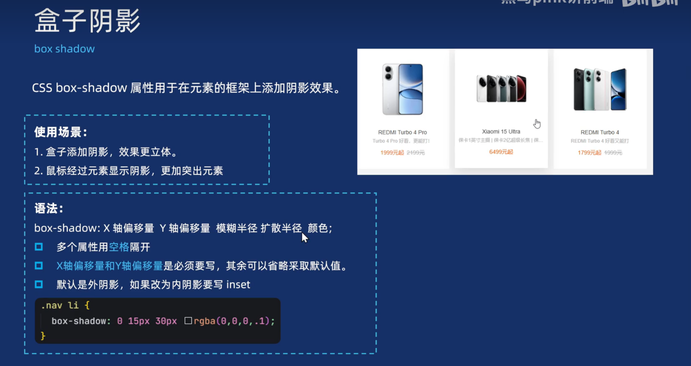
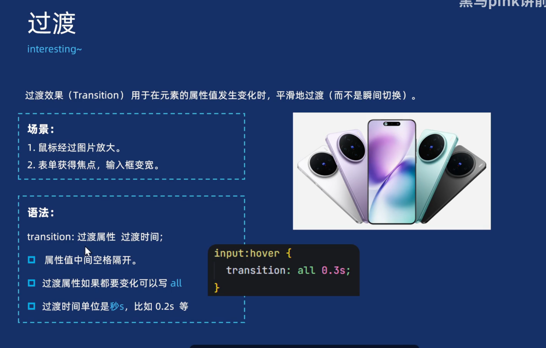
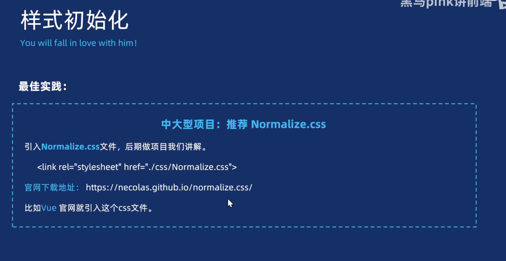
样式初始化
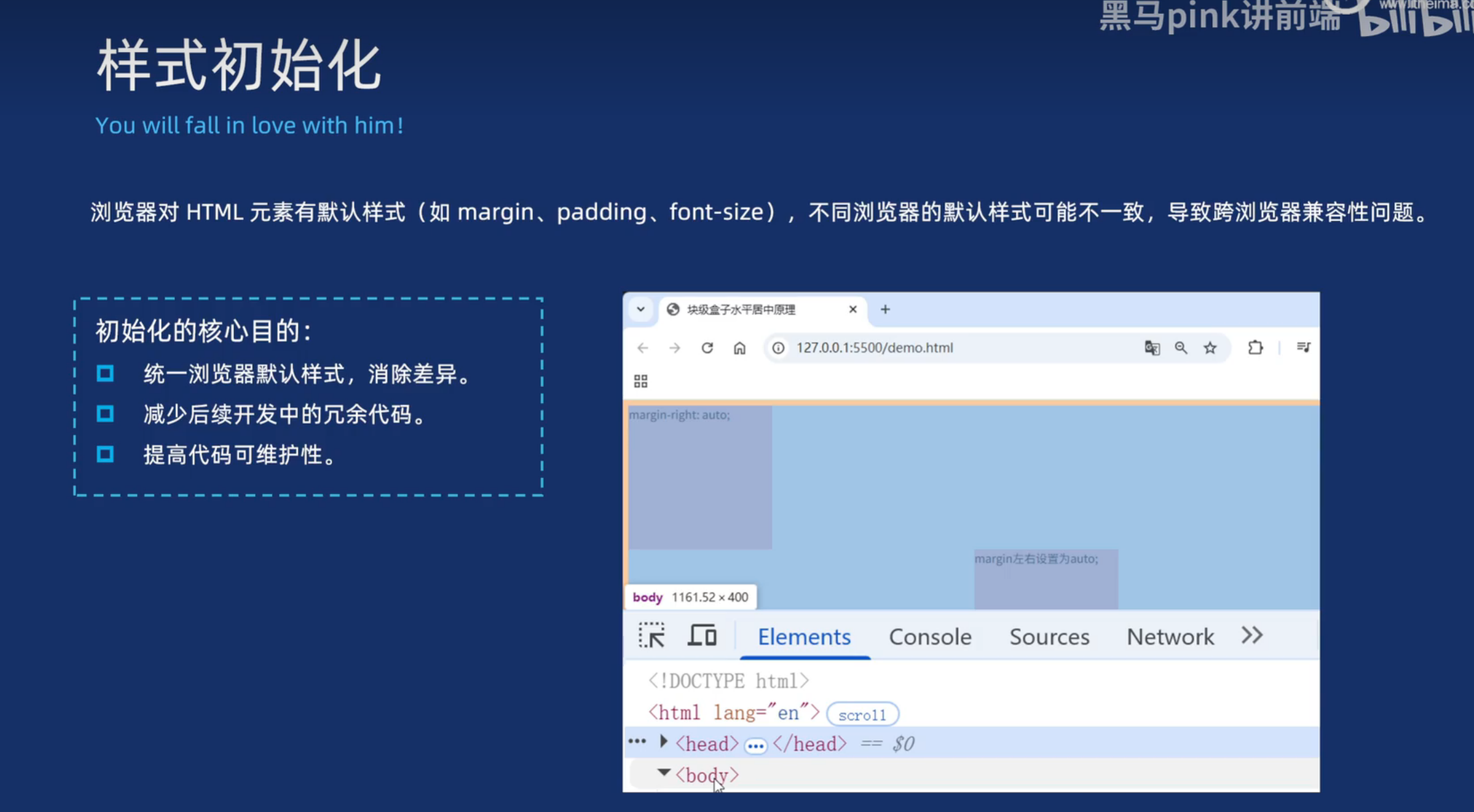
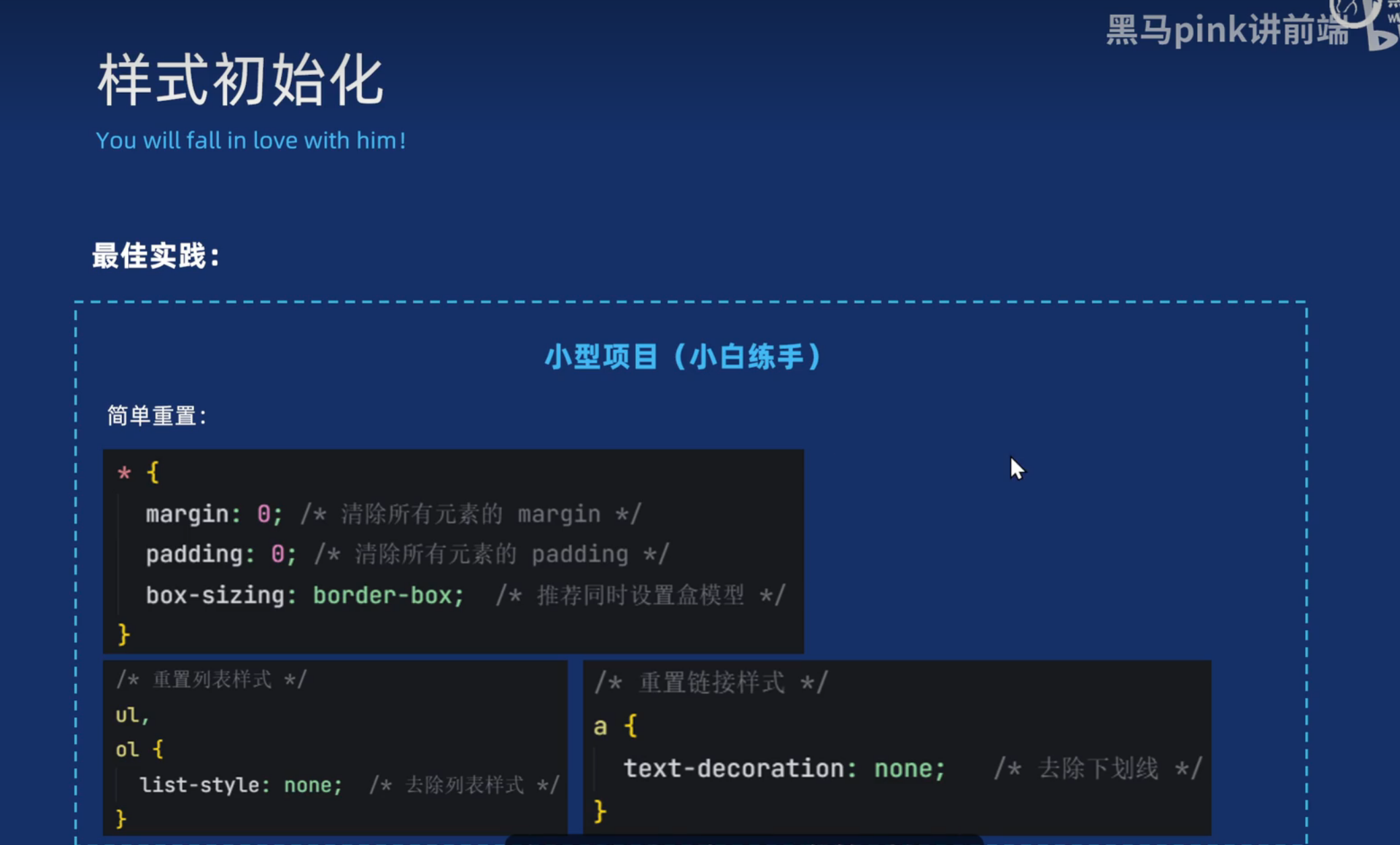
盒子案例-小米卡片
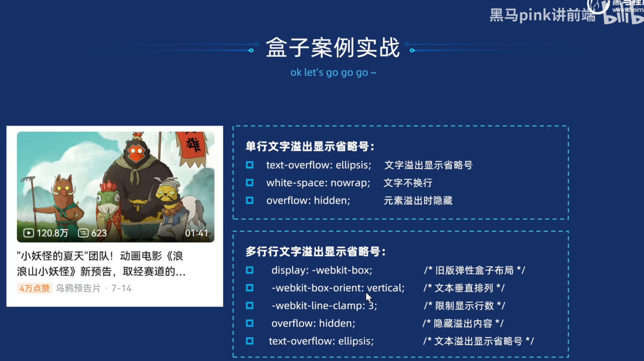
<!DOCTYPE html>
<html lang="en">

<head>
  <meta charset="UTF-8">
  <meta name="viewport" content="width=device-width, initial-scale=1.0">
  <title>Document</title>
  <style>
    * {
      margin: 0;
      padding: 0;
      box-sizing: border-box;
    }

    body {
      background-color: #ccc;
    }

    .content {
      width: 234px;
      height: 300px;
      background-color: #fff;
      margin: 100px auto;
      text-align: center;
      transition: all 0.4s;
    }

    .content img {
      width: 160px;
      height: 160px;
      margin-top: 20px;
    }

    .content .title {
      font-size: 14px;
      font-weight: 400;
      color: #333;
      margin-top: 18px;
    }

    .content .desc {
      font-size: 12px;
      color: #b0b0b0;
      /* 单行文本超出部分省略号显示 */
      /* 超出部分隐藏 */
      overflow: hidden;
      /* 超出部分省略号显示 */
      text-overflow: ellipsis;
      /* 不换行 */
      white-space: nowrap;
      padding-left: 10px;
      padding-right: 10px;
    }

    .content:hover {
      box-shadow: 0 15px 30px rgba(0, 0, 0, 0.1);
    }

    .content .price {
      font-size: 14px;
      color: #b0b0b0;
      margin-top: 10px;
    }

    .content .price span {
      color: #ff6700;
    }
  </style>
</head>

<body>
  <div class="content">
    <img src="./img/mi.webp" alt="">
    <h3 class="title">Xiaomi Buds 5</h3>
    <p class="desc">舒适无感佩戴|高通全链路无损音频|哈曼 AudioEFX 联合调音</p>
    <p class="price">
      <span>659元</span>
      <del>699元</del>
    </p>
  </div>

</body>

</html>
盒子案例-淘宝导航
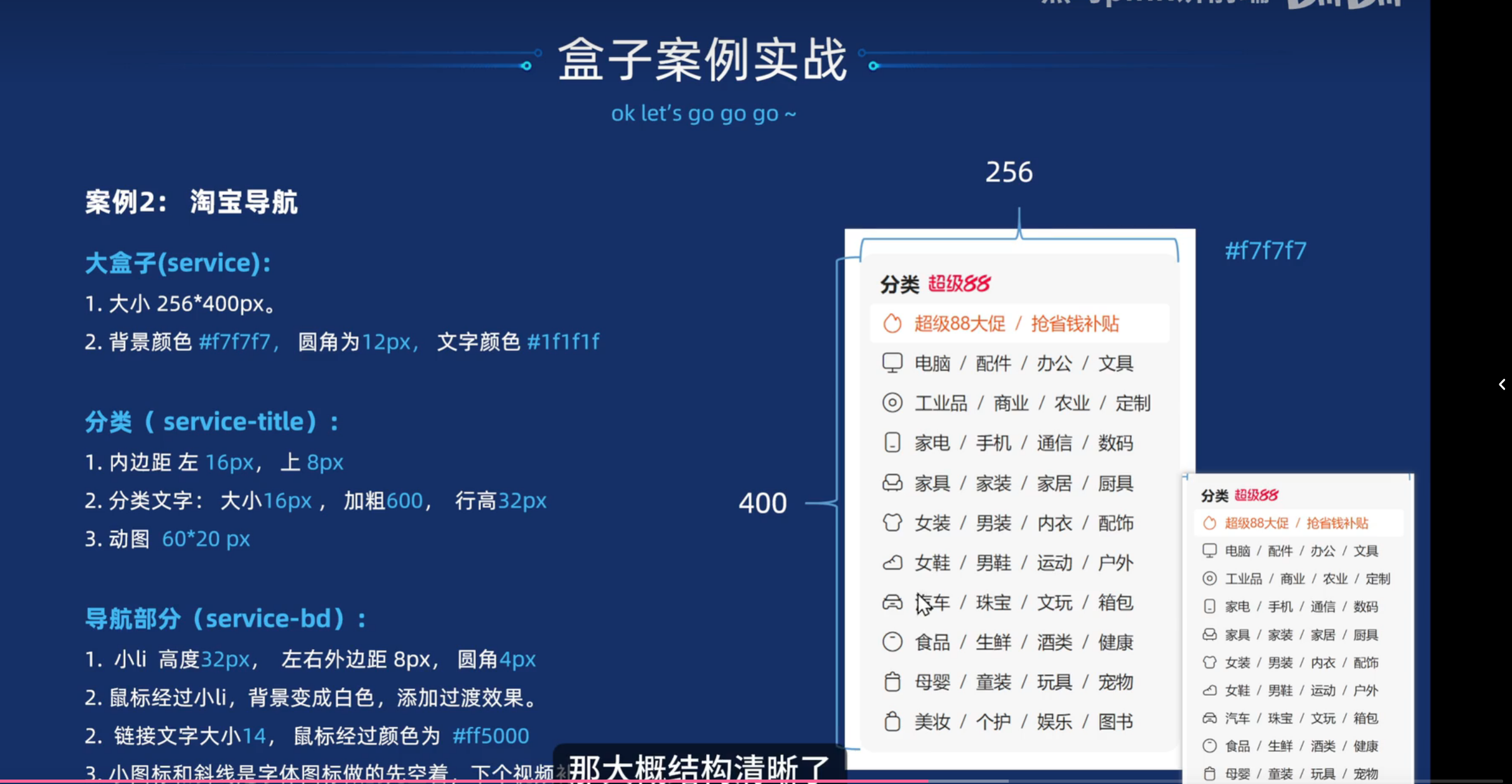
<!DOCTYPE html>
<html lang="en">

<head>
  <meta charset="UTF-8">
  <meta name="viewport" content="width=device-width, initial-scale=1.0">
  <title>Document</title>
  <link rel="stylesheet" href="./iconfont/iconfont.css">
  <style>
    * {
      margin: 0;
      padding: 0;
      box-sizing: border-box;
    }

    a {
      text-decoration: none;
      color: #1f1f1f;
    }

    ol,
    ul {
      list-style: none;
    }

    .box {
      width: 256px;
      height: 400px;
      background-color: #f7f7f7;
      color: #1f1f1f;
      border-radius: 12px;
      margin: 100px auto;

    }

    .box-title {
      font-size: 16px;
      font-weight: 600;
      padding: 8px 0 0 16px;
      line-height: 32px;
      color: #1f1f1f;
    }

    .box-title img {
      width: 60px;
      height: 20px;
      margin-left: 4px;
    }

    .bd li {
      line-height: 32px;
      border-radius: 4px;
      margin: 0 8px;
      height: 32px;
      transition: all 0.5s;
      padding-left: 10px;
    }

    .bd li:hover {
      background-color: #f7f7f7;
    }

    .bd li a {
      font-size: 14px;
    }

    .bd li a:hover {
      color: #ff5000;
    }

    .bd li:first-child,
    .bd li:first-child a {
      color: #ff5000;
    }
  </style>

</head>

<body>
  <div class="box">
    <div class="box-title">
      <span>分类</span>
      <img src="img/888.gif" alt="">
    </div>
    <ul class="bd">
      <li>
        <i class="iconfont icon-huore"></i>
        <a href="">超级88大促</a>
        <span class="iconfont icon-xiexian"></span>
        <a href="">抢省钱补贴</a>

      </li>
      <li>
        <i class="iconfont icon-diannao_o"></i>
        <a href="">电脑</a>
        <span class="iconfont icon-xiexian"></span>
        <a href="">配件</a>
        <span class="iconfont icon-xiexian"></span>
        <a href="">办公</a>
        <span class="iconfont icon-xiexian"></span>
        <a href="">文具</a>
      </li>
      <li>
        <i class="iconfont icon-diannao_o"></i>
        <a href="">电脑</a>
        <span class="iconfont icon-xiexian"></span>
        <a href="">配件</a>
        <span class="iconfont icon-xiexian"></span>
        <a href="">办公</a>
        <span class="iconfont icon-xiexian"></span>
        <a href="">文具</a>
      </li>
      <li>
        <i class="iconfont icon-diannao_o"></i>
        <a href="">电脑</a>
        <span class="iconfont icon-xiexian"></span>
        <a href="">配件</a>
        <span class="iconfont icon-xiexian"></span>
        <a href="">办公</a>
        <span class="iconfont icon-xiexian"></span>
        <a href="">文具</a>
      </li>
      <li>
        <i class="iconfont icon-diannao_o"></i>
        <a href="">电脑</a>
        <span class="iconfont icon-xiexian"></span>
        <a href="">配件</a>
        <span class="iconfont icon-xiexian"></span>
        <a href="">办公</a>
        <span class="iconfont icon-xiexian"></span>
        <a href="">文具</a>
      </li>
      <li>
        <i class="iconfont icon-diannao_o"></i>
        <a href="">电脑</a>
        <span class="iconfont icon-xiexian"></span>
        <a href="">配件</a>
        <span class="iconfont icon-xiexian"></span>
        <a href="">办公</a>
        <span class="iconfont icon-xiexian"></span>
        <a href="">文具</a>
      </li>
      <li>
        <i class="iconfont icon-diannao_o"></i>
        <a href="">电脑</a>
        <span class="iconfont icon-xiexian"></span>
        <a href="">配件</a>
        <span class="iconfont icon-xiexian"></span>
        <a href="">办公</a>
        <span class="iconfont icon-xiexian"></span>
        <a href="">文具</a>
      </li>
      <li>
        <i class="iconfont icon-diannao_o"></i>
        <a href="">电脑</a>
        <span class="iconfont icon-xiexian"></span>
        <a href="">配件</a>
        <span class="iconfont icon-xiexian"></span>
        <a href="">办公</a>
        <span class="iconfont icon-xiexian"></span>
        <a href="">文具</a>
      </li>
      <li>
        <i class="iconfont icon-diannao_o"></i>
        <a href="">电脑</a>
        <span class="iconfont icon-xiexian"></span>
        <a href="">配件</a>
        <span class="iconfont icon-xiexian"></span>
        <a href="">办公</a>
        <span class="iconfont icon-xiexian"></span>
        <a href="">文具</a>
      </li>
      <li>
        <i class="iconfont icon-diannao_o"></i>
        <a href="">电脑</a>
        <span class="iconfont icon-xiexian"></span>
        <a href="">配件</a>
        <span class="iconfont icon-xiexian"></span>
        <a href="">办公</a>
        <span class="iconfont icon-xiexian"></span>
        <a href="">文具</a>
      </li>
      <li>
        <i class="iconfont icon-diannao_o"></i>
        <a href="">电脑</a>
        <span class="iconfont icon-xiexian"></span>
        <a href="">配件</a>
        <span class="iconfont icon-xiexian"></span>
        <a href="">办公</a>
        <span class="iconfont icon-xiexian"></span>
        <a href="">文具</a>
      </li>

    </ul>
  </div>
</body>

</html>
字体图标
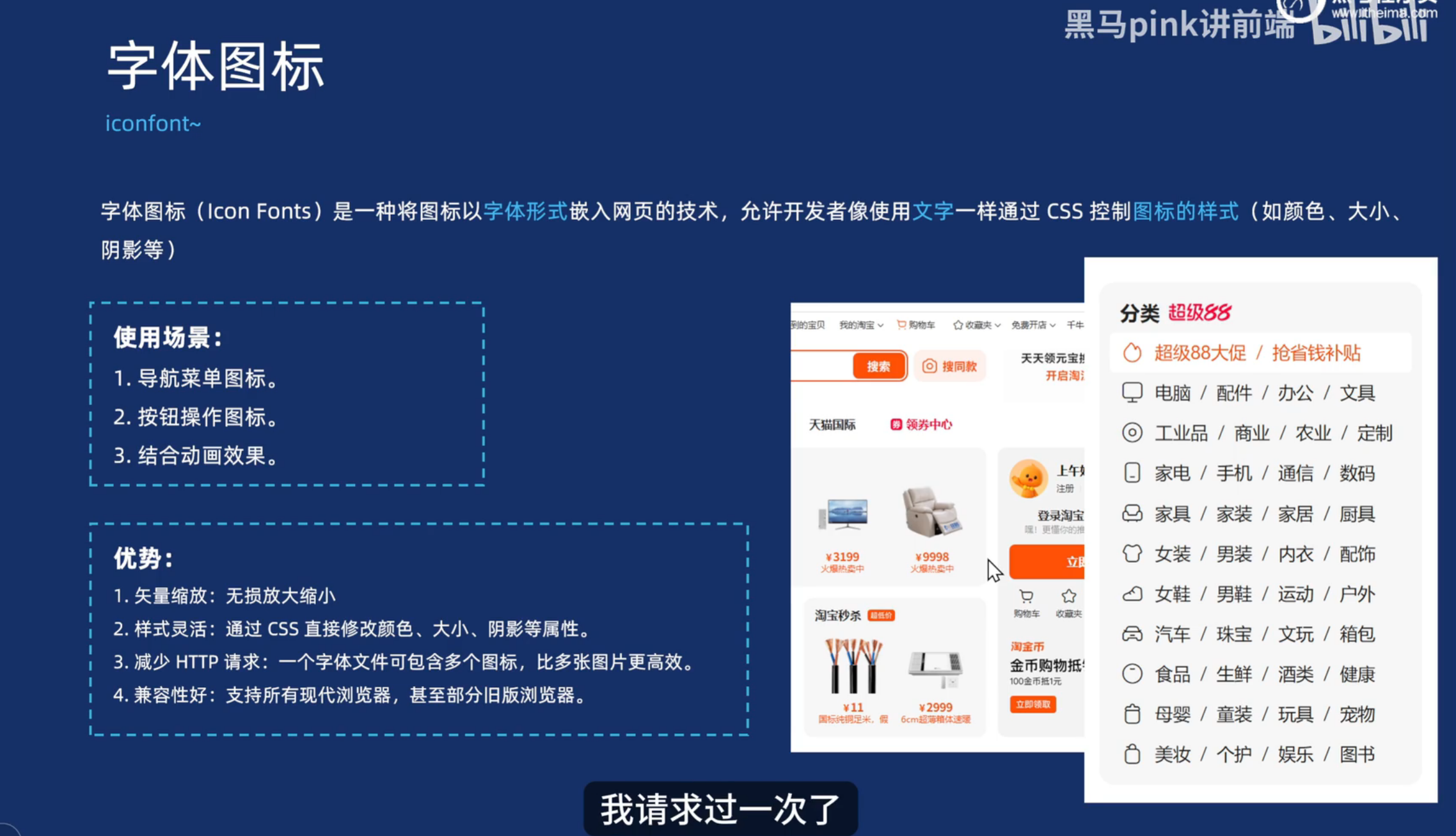
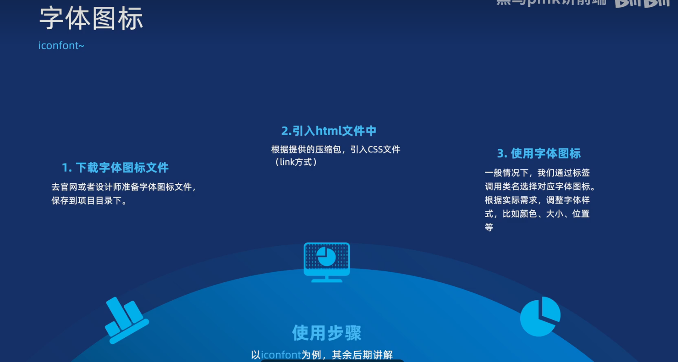
<!DOCTYPE html>
<html lang="en">

<head>
  <meta charset="UTF-8">
  <meta name="viewport" content="width=device-width, initial-scale=1.0">
  <title>Document</title>
  <link rel="stylesheet" href="./download/font_jq4i9ukh8f9/iconfont.css">
  <style>
    .icon-fanxuan {
      font-size: 30px;
      color: red;
    }
  </style>
</head>

<body>
  <span class="iconfont icon-fanxuan"></span>
</body>

</html>
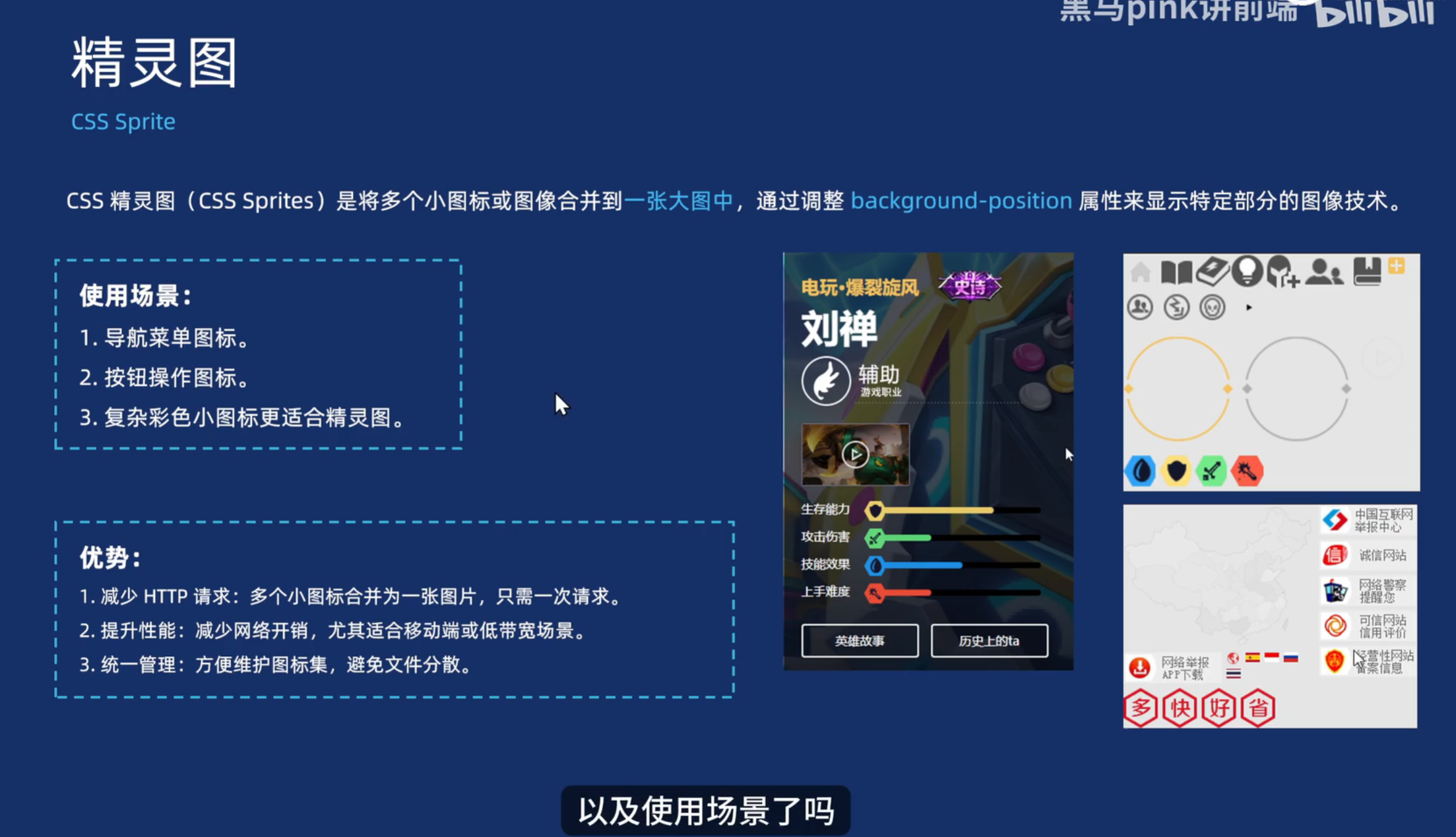
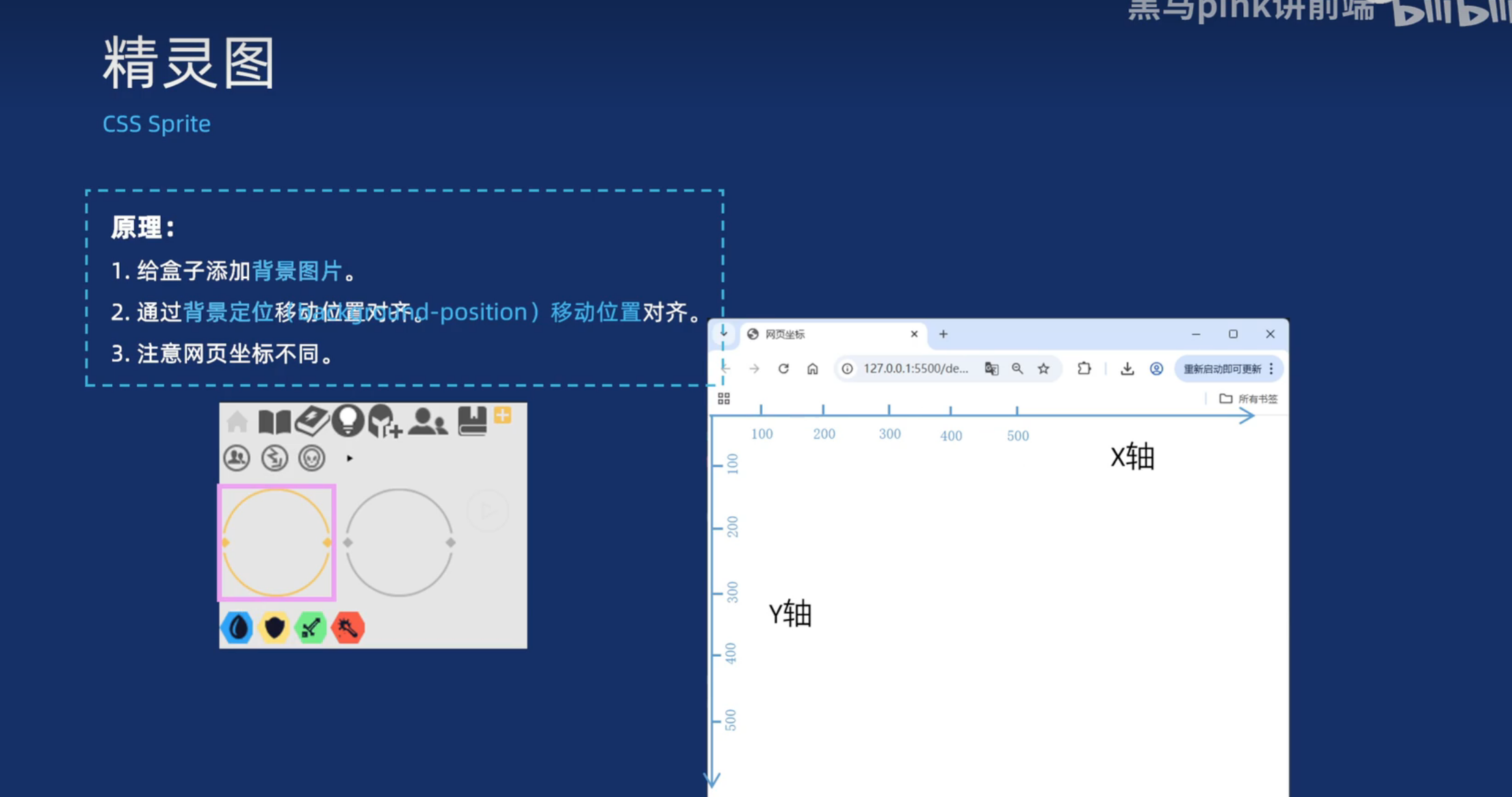
精灵图
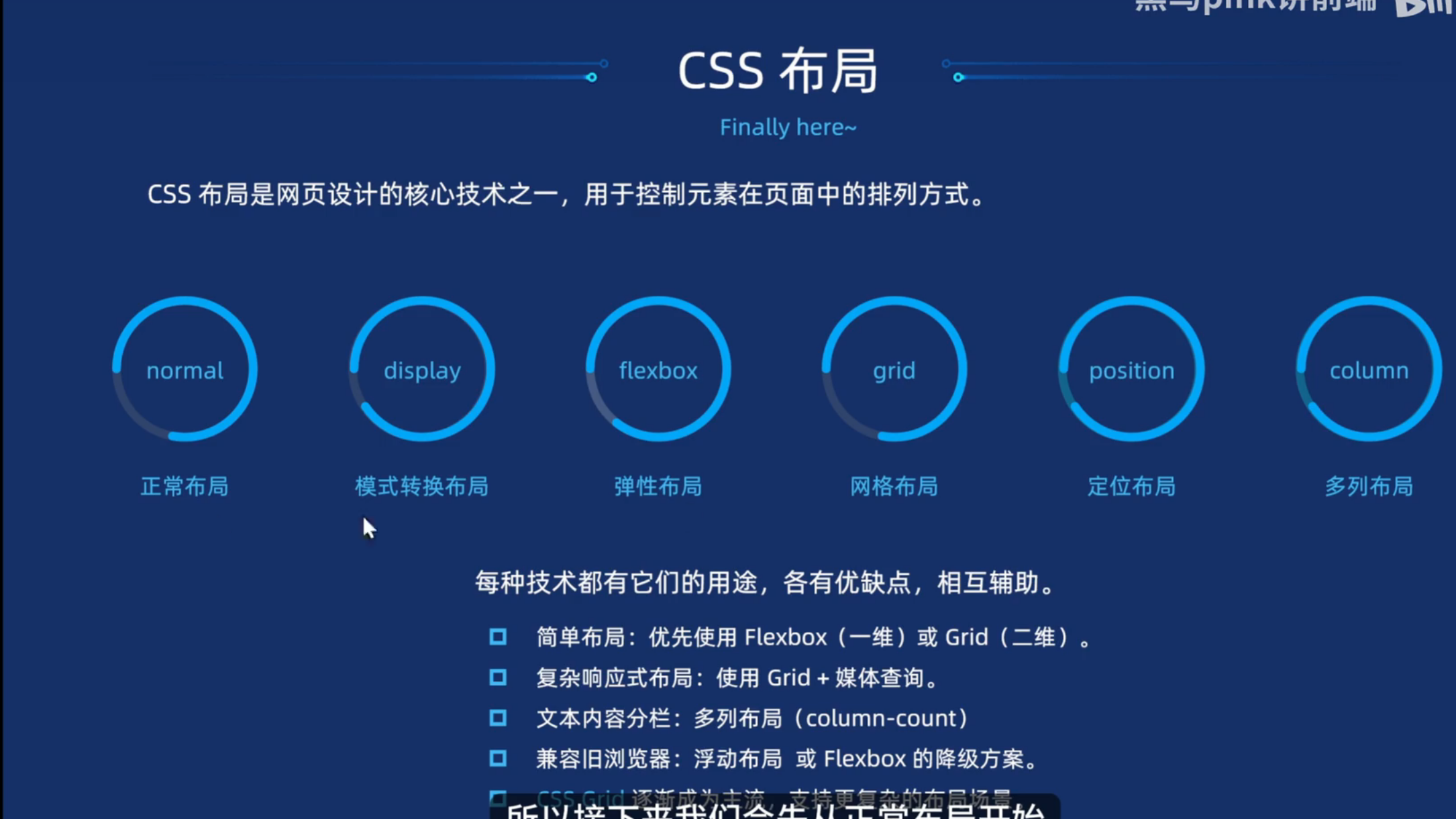
CSS布局
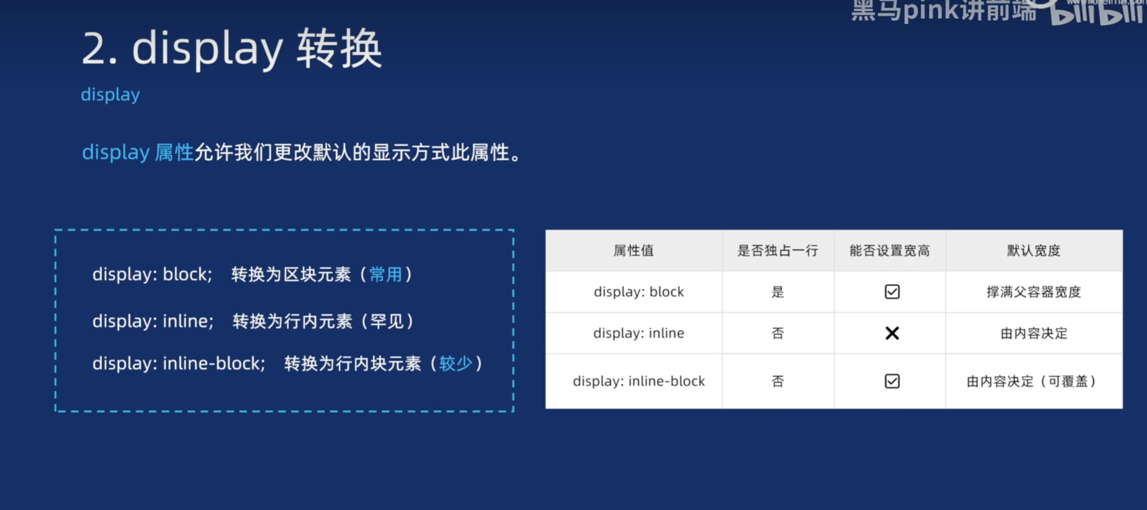
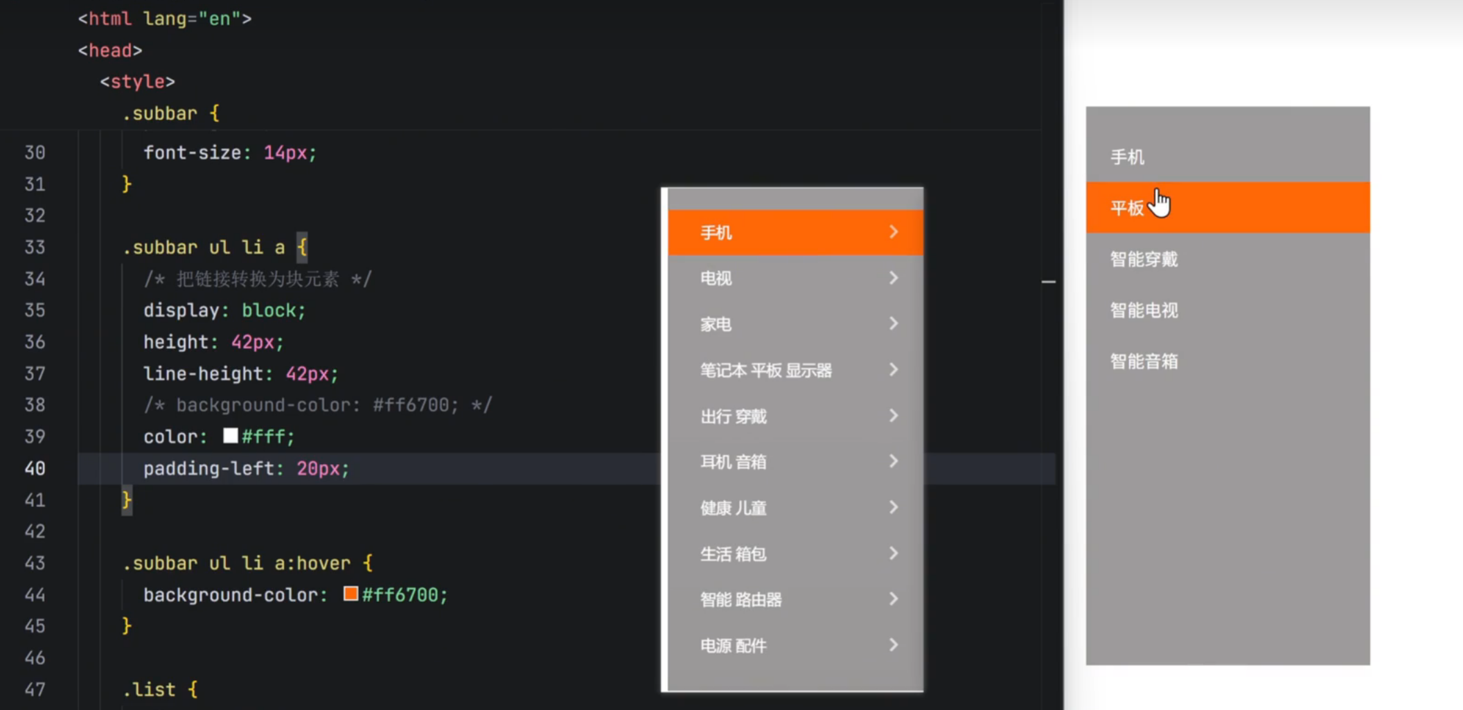
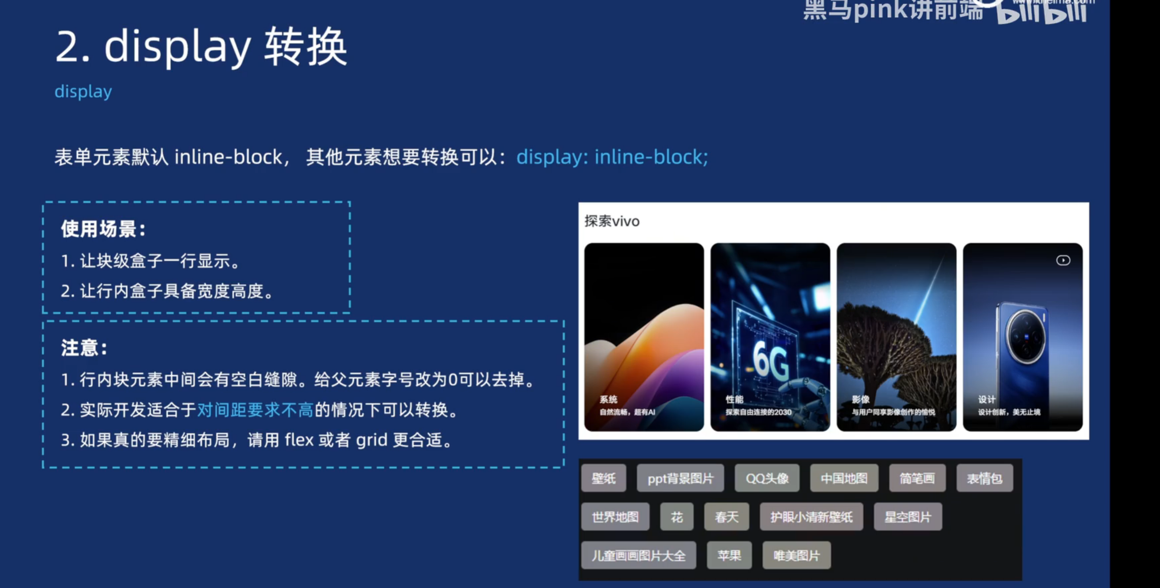
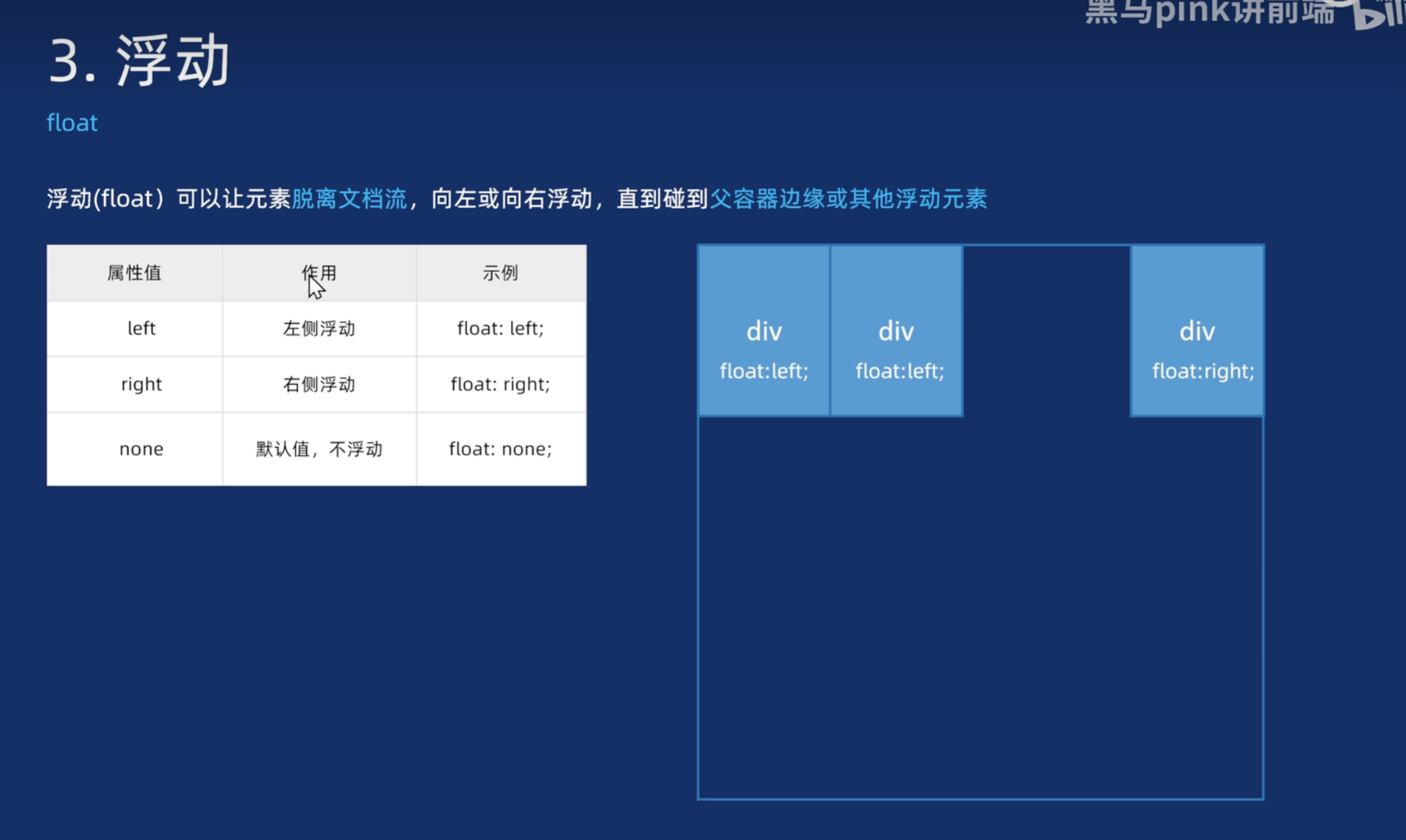
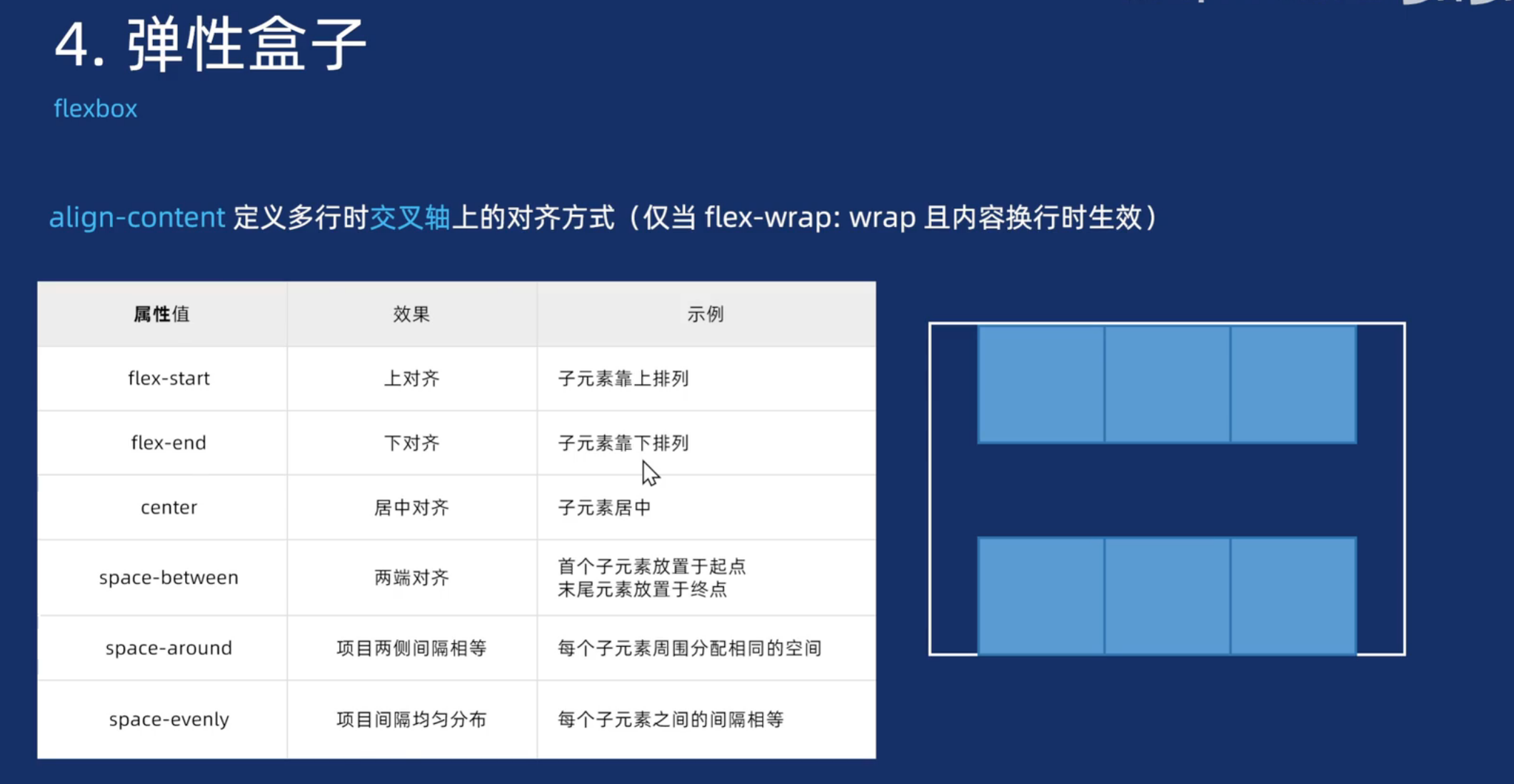
弹性盒子
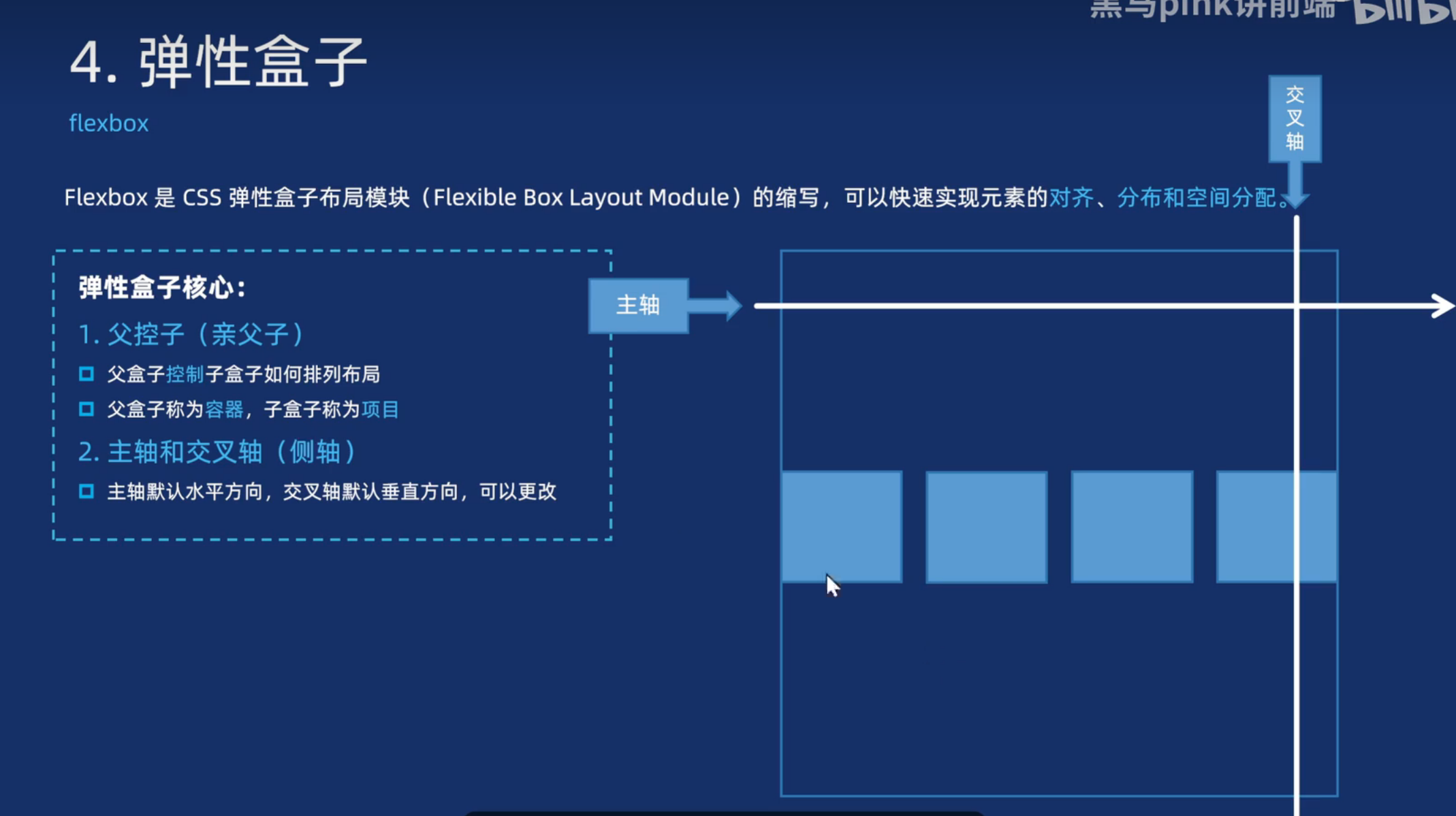
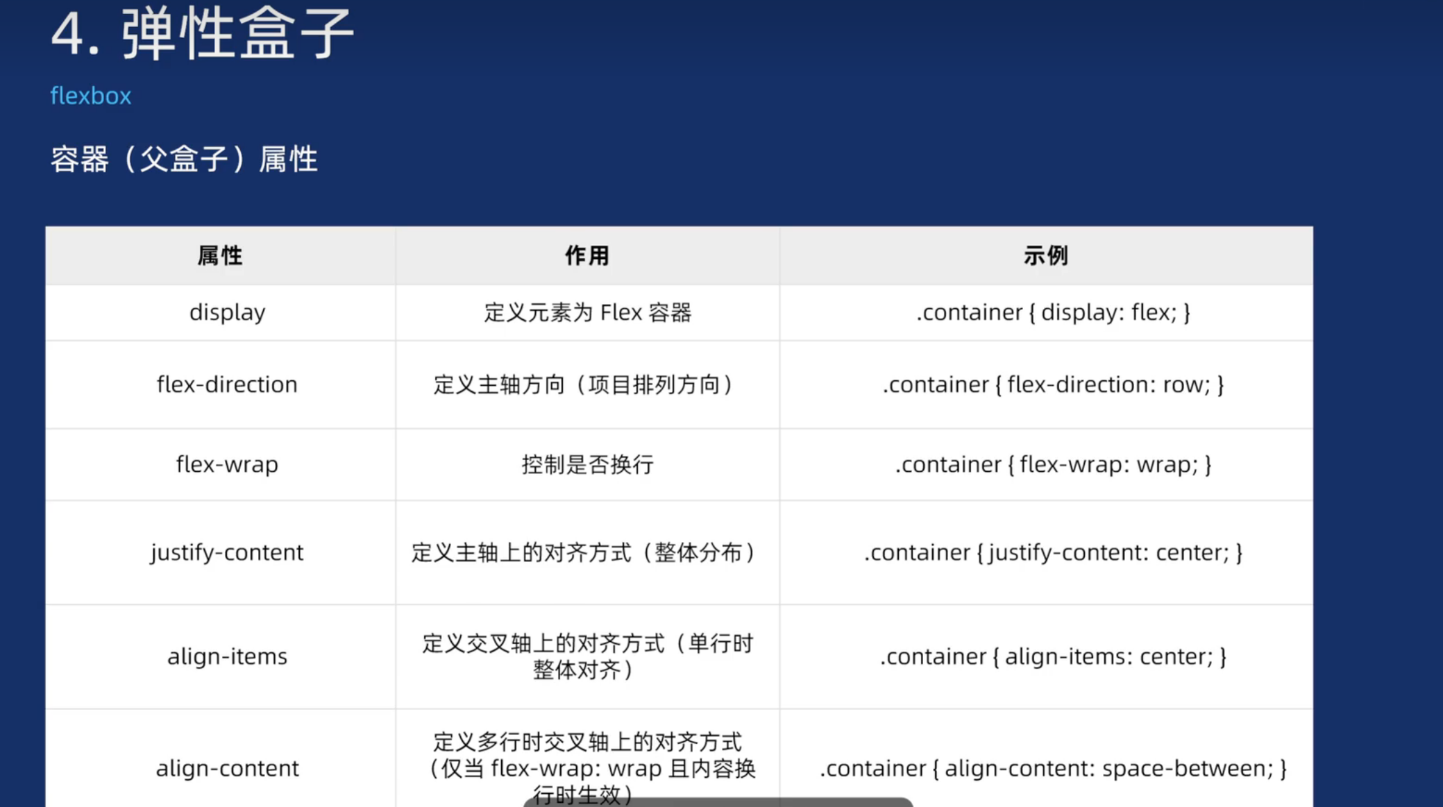
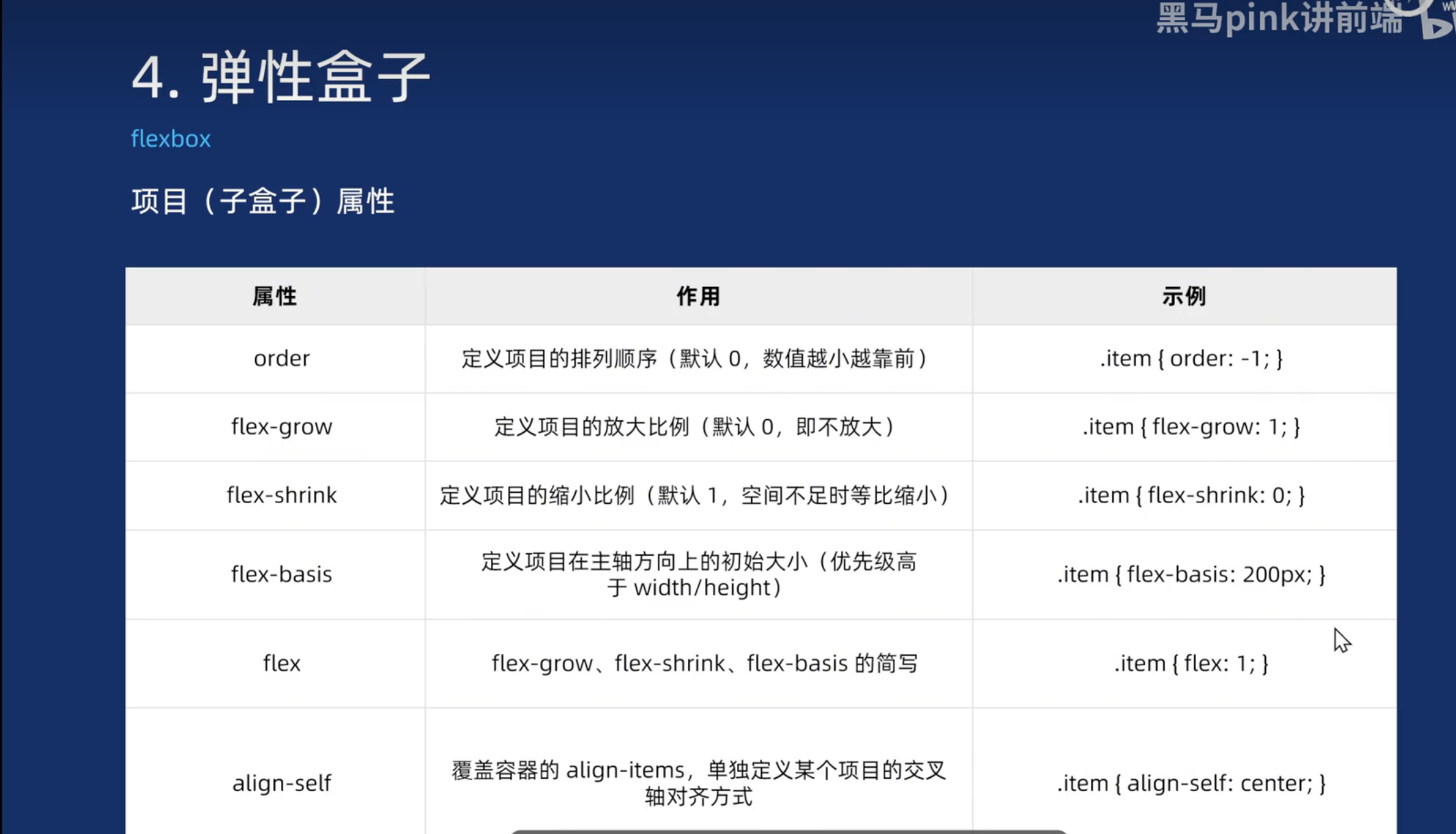
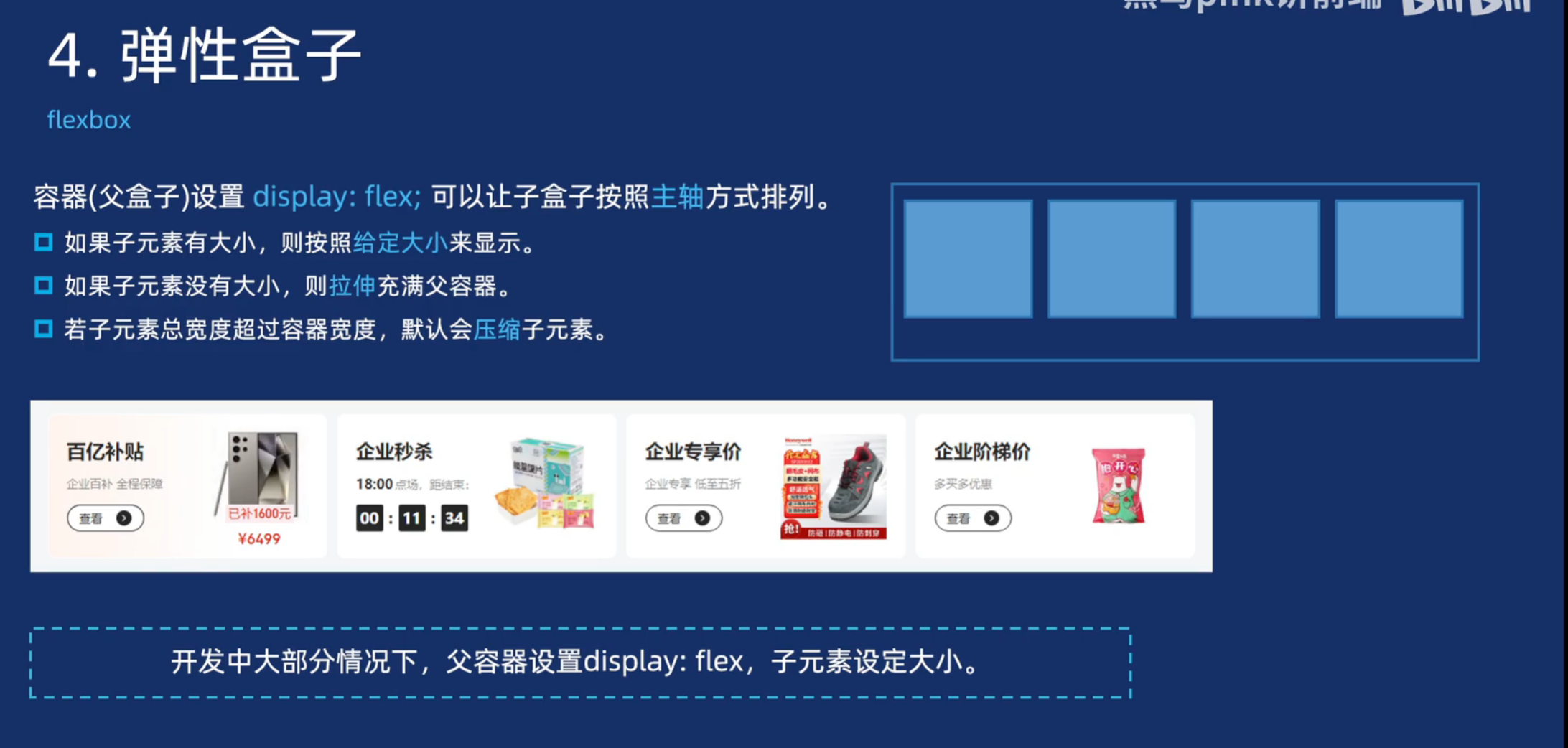
<!DOCTYPE html>
<html lang="en">

<head>
  <meta charset="UTF-8">
  <meta name="viewport" content="width=device-width, initial-scale=1.0">
  <title>Document</title>

  <style>
    * {
      margin: 0;
      padding: 0;
      box-sizing: border-box;
    }

    .box {
      display: flex;

    }


    .box .item {
      width: 100px;
      height: 100px;
      background-color: pink;
      border-radius: 10px;
    }
  </style>
</head>

<body>
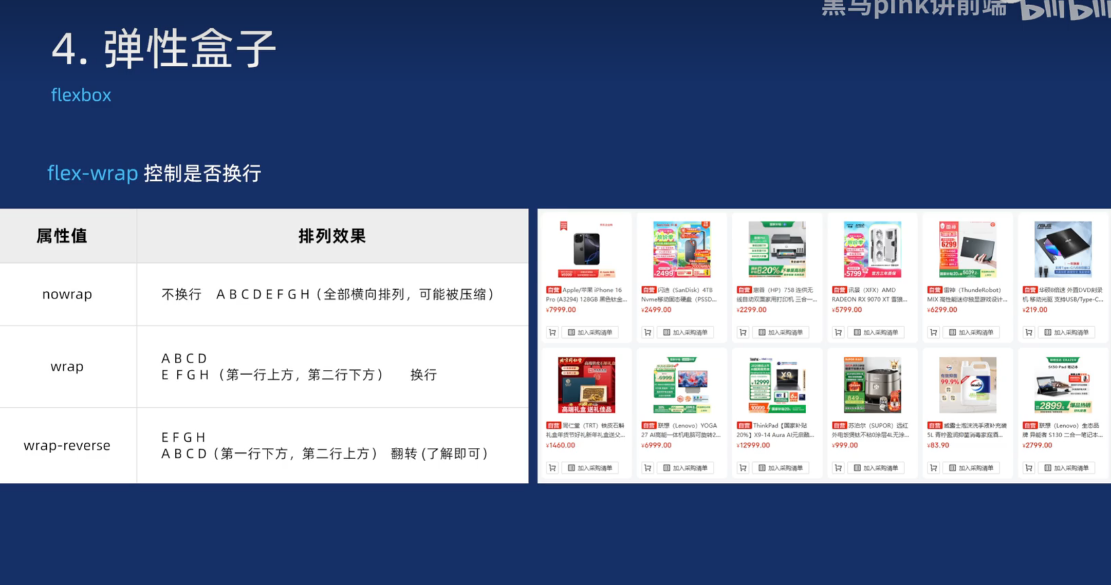
  <div class="box">
    <div class="item">1</div>
    <div class="item">2</div>
    <div class="item">3</div>
    <div class="item">4</div>

  </div>
</body>

</html>
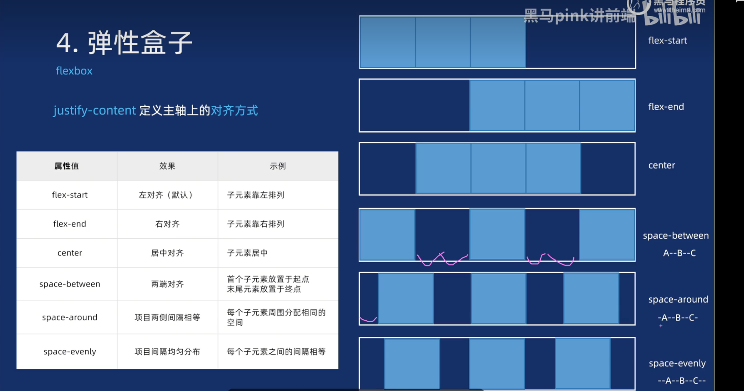
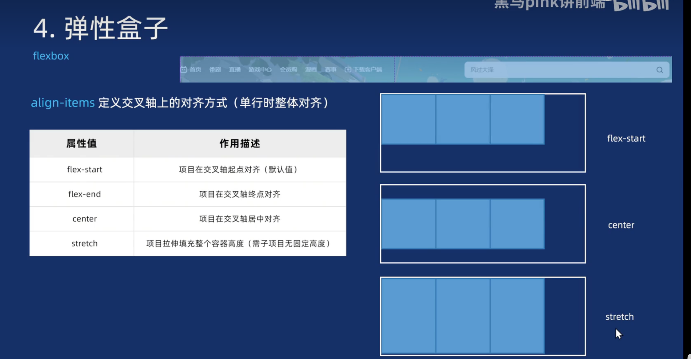
<!DOCTYPE html>
<html lang="en">

<head>
  <meta charset="UTF-8">
  <meta name="viewport" content="width=device-width, initial-scale=1.0">
  <title>Document</title>

  <style>
    * {
      margin: 0;
      padding: 0;
      box-sizing: border-box;
    }

    .box {
      display: flex;
      /* justify-content: center; */
      justify-content: space-between;
      border: 1px solid red;
      width: 500px;
      height: 500px;
      align-items: center;
    }


    .box .item {
      width: 100px;
      height: 100px;
      background-color: pink;
      border-radius: 10px;
    }
  </style>
</head>

<body>
  <div class="box">
    <div class="item">1</div>
    <div class="item">2</div>
    <div class="item">3</div>
    <div class="item">4</div>

  </div>
</body>

</html>
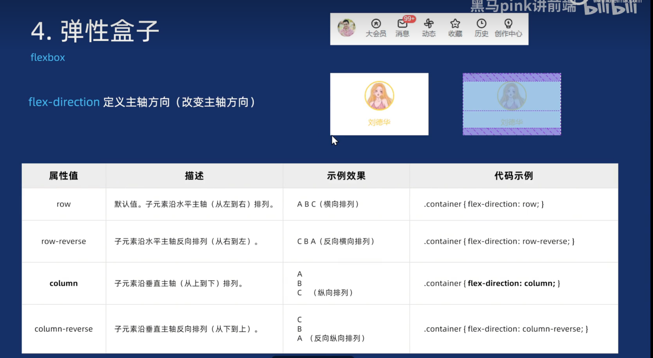
a链接标签如果给了flex布局,可以直接设置宽带和高度
<!DOCTYPE html>
<html lang="en">

<head>
  <meta charset="UTF-8">
  <meta name="viewport" content="width=device-width, initial-scale=1.0">
  <title>弹性布局-修改主轴方向</title>
  <link rel="stylesheet" href="./iconfont/iconfont.css">
  <style>
    * {
      margin: 0;
      padding: 0;
      box-sizing: border-box;
    }

    ul,
    ol {
      list-style: none;
    }

    a {
      text-decoration: none;
      color: #333;
    }

    .sanlian {
      display: flex;
      margin: 20px;
      font-size: 13px;
    }

    .iconfont {
      font-size: 30px;
    }

    .sanlian li {
      width: 60px;
      height: 80px;
      /* border: 1px solid red; */
    }

    .sanlian li a {
      display: flex;
      /* 改变主轴的方向 */
      flex-direction: column;
      /* 主轴居中对齐 */
      justify-content: center;
      /* 交叉轴居中对齐 */
      align-items: center;
      /* a 如果给了flex布局,则可以直接设置宽度和高度 */
      height: 100%;
    }
  </style>
</head>

<body>
  <ul class="sanlian">
    <li>
      <a href="#">
        <i class="iconfont icon-dianzan"></i>
        <p>点赞</p>
      </a>
    </li>
    <li>
      <a href="#">
        <i class="iconfont icon-yingbi"></i>
        <p>硬币</p>
      </a>
    </li>
    <li>
      <a href="#">
        <i class="iconfont icon-shoucang"></i>
        <p>收藏</p>
      </a>
    </li>
  </ul>
</body>

</html>

码道开发者社区,聚焦华为云码道 CodeArts 代码智能体,沉淀 Agent、Skill、鸿蒙开发实战内容,供开发者查阅资料、交流技术、分享工程实践
更多推荐


 27
27 0
0- 0


 已为社区贡献6条内容

所有评论(0)