前端Web开发HTML5+CSS3(黑马学习笔记)-day06
·
Flex布局
1.标准流
标准流也叫文档流,指的是标签在页面中默认的排布规则,例如:块元素独占一行,行内元素可以一行显示多个。

2.浮动
基本使用作用:让块元素水平排列。属性名:float属性值
- left:左对齐
- right:右对齐
例如:<style>/* 特点:顶对齐;具备行内块显示模式特点;浮动的盒子会脱标 */.one {width: 100px;height: 100px;background-color: brown;float: left;}.two {width: 200px;height: 200px;background-color: orange;/* float: left; */float: right;}</style>\<div class="one">one</div><div class="two">two</div>特点:
- 浮动后的盒子顶对齐
- 浮动后的盒子具备行内块特点
- 浮动后的盒子脱标,不占用标准流的位
产品区域布局
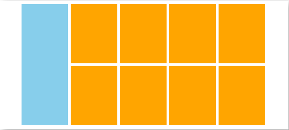
HTML标签<!-- 版心:左右,右面:8个产品 → 8个 li --><div class="product"><div class="left"></div><div class="right"><ul><li></li><li></li><li></li><li></li><li></li><li></li><li></li><li></li></ul></div></div>CSS样式<style>* {margin: 0;padding: 0;}li {list-style: none;}.product {margin: 50px auto;width: 1226px;height: 628px;background-color: pink;}.left {float: left;width: 234px;height: 628px;background-color: skyblue;}.right {float: right;width: 978px;height: 628px;background-color: brown;}.right li {float: left;margin-right: 14px;margin-bottom: 14px;width: 234px;height: 300px;background-color: orange;}/* 第四个li和第八个li 去掉右侧的margin */.right li:nth-child(4n) {margin-right: 0;}/* 细节:如果父级宽度不够,浮动的盒子会掉下来 */</style>清除浮动
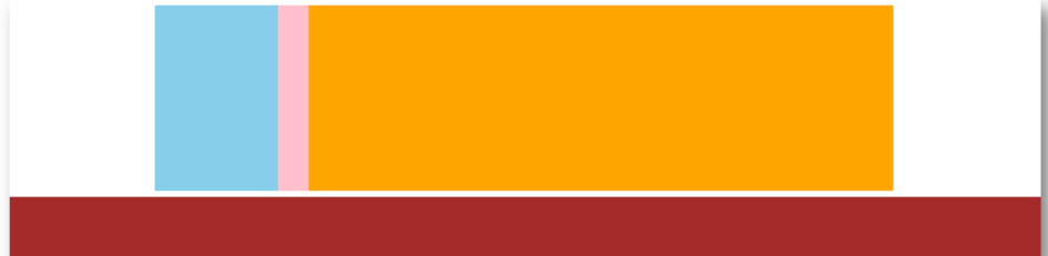
场景:浮动元素会脱标,如果父级没有高度,子级无法撑开父级高度(可能导致页面布局错乱)解决方法:清除浮动(清除浮动带来的影响)场景搭建<style>.top {margin: 10px auto;width: 1200px;/* height: 300px; */background-color: pink;}.left {ũ oat: left;width: 200px;height: 300px;background-color: skyblue;}.right {ũ oat: right;width: 950px;height: 300px;background-color: orange;}.bottom {height: 100px;background-color: brown;}</style><div class="top"><div class="left"></div><div class="right"></div></div><div class="bottom"></div>额外标签法
在父元素内容的最后添加一个块级元素,设置 CSS 属性 clear: both<style>.clearŨ x {clear: both;}</style><div class="father"><div class="left"></div><div class="right"></div><div class="clearŨ x"></div></div>单伪元素法
1. 准备 after 伪元素.clearŨ x::after {content: "";display: block;clear: both;}2. 父级使用 clearfix 类<div class="father clearfix"></div>双伪元素法
1. 准备 after 和 before 伪元素/* before 解决外边距塌陷问题 *//* 双伪元素法 */.clearŨ x::before,.clearŨ x::after {content: "";display: table;}/* after 清除浮动 */.clearŨ x::after {clear: both;}2. 父级使用 clearfix 类<div class="father clearfix"></div>overfow法
.father {margin: 10px auto;width: 1200px;/* height: 300px; */background-color: pink;overũ ow: hidden;}
3.Flex布局
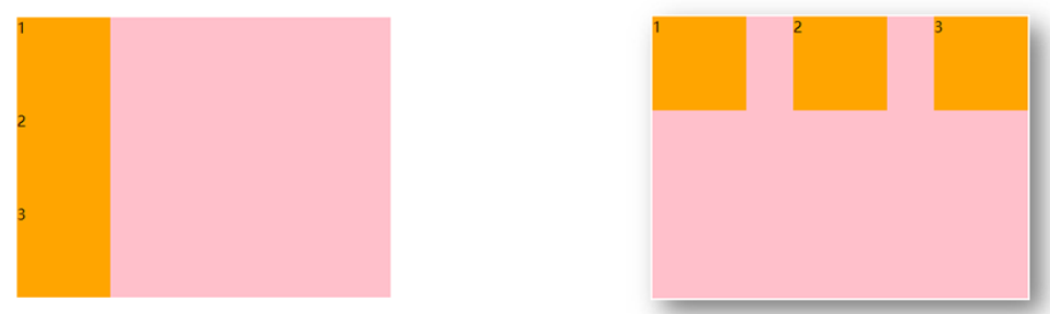
Flex 布局也叫弹性布局,是浏览器提倡的布局模型,非常适合结构化布局,提供了强大的空间分布和对齐能力。Flex 模型不会产生浮动布局中脱标现象,布局网页更简单、更灵活。Flex组成
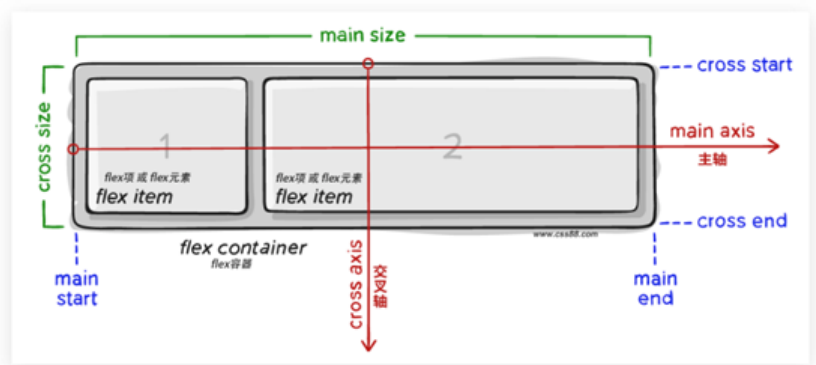
设置方式:给父元素设置 display: ũex,子元素可以自动挤压或拉伸组成部分:
- 弹性容器
- 弹性盒子
- 主轴:默认在水平方向
- 侧轴 / 交叉轴:默认在垂直方向
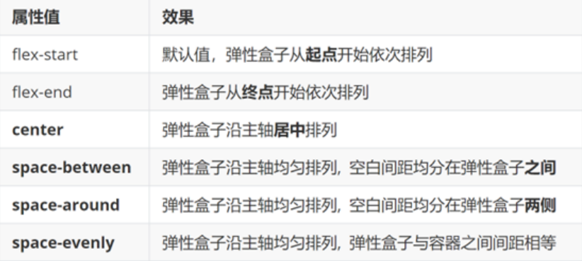
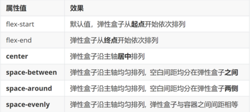
主轴对齐方式
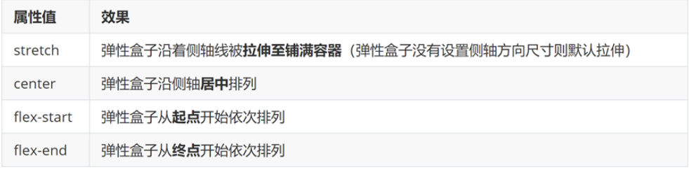
属性名:justify-content侧轴对齐方式
- align-items:当前弹性容器内所有弹性盒子的侧轴对齐方式(给弹性容器设置)
- align-self:单独控制某个弹性盒子的侧轴对齐方式(给弹性盒子设置)
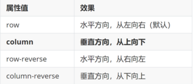
修改主轴方向
主轴默认在水平方向,侧轴默认在垂直方向属性名:flex-direction弹性伸缩比
作用:控制弹性盒子的主轴方向的尺寸。属性名:flex属性值:整数数字,表示占用父级剩余尺寸的份数。弹性盒子换行
弹性盒子可以自动挤压或拉伸,默认情况下,所有弹性盒子都在一行显示。属性名:flex-wrap属性值wrap:换行nowrap:不换行(默认)行内对齐方式
属性名:align-content注意:该属性对单行弹性盒子模型无效

码道开发者社区,聚焦华为云码道 CodeArts 代码智能体,沉淀 Agent、Skill、鸿蒙开发实战内容,供开发者查阅资料、交流技术、分享工程实践
更多推荐

 22
22 0
0- 0


 已为社区贡献6条内容

所有评论(0)